Words: Veronika Vrestalova – Designer
Category(s): Branding
Date: 10th July 2025
Every B2B designer steals. It’s built into the DNA of the creative process. The standard starting point of a brand or website project is mood boarding, gathering a magpie’s nest of shiny influences and inspiration. Things that exemplify hallmarks of traditional B2B design and branding. Things that nod to that tradition while new-minting a fresh riff. Or things that diverge from classic tropes altogether to blaze a new trail.
Our B2B mood board blog series shares what’s caught our designers’ eyes. It could be a pin-sharp visual identity, a beautifully designed website, or a surprising, unconventional creative choice. Our designers take you beneath the surface to explore what it means for digital design in B2B tech.
For our first post, we’re kicking things off with something that’s hardwired into our approach to brands at Beneath. Here’s Veronika to explain why B2B storytelling is about your visual language as much as your verbal one.
There’s no definitive, fixed rulebook when it comes to B2B web design. Yet if you look at most websites, you might think otherwise.
No matter where in the user journey, they tend to follow the same template: a utilitarian, dense arrangement of blocks of text, with some images and icons as a decorative extra. At Beneath, we’ve often wondered whether this is the best template.
We champion a storyful approach to B2B brands. That means things like crafting a compelling narrative, understanding why now is the time to tell your brand’s story, finding where the pain lies for your audience and how you resolve it. But instead of telling that story well – as the strategy for your website – a typical B2B website instead rushes to mention all the technical features, benefits and specifications that set the product apart. Oh and that the company’s big flagship event is coming up. And there’s a 10% discount. And there are experts waiting to book a call with you right now…
Designers end up having to play a tricky game of Tetris, trying to slot this clutter of information into the same standard structural web components, over and over again.
First and foremost, every website should be focused on being functional, beautiful and engaging. And, by using some tricks of storyful web design, it doesn’t have to come at the expense of stakeholder requirements. Here’s what it can look like.
In praise of wasting space
B2B designers can wrestle with websites in a struggle to save space and make them as compact as possible, packing in text and information. But the “Who is guilty” website shows what happens when you make space, instead. 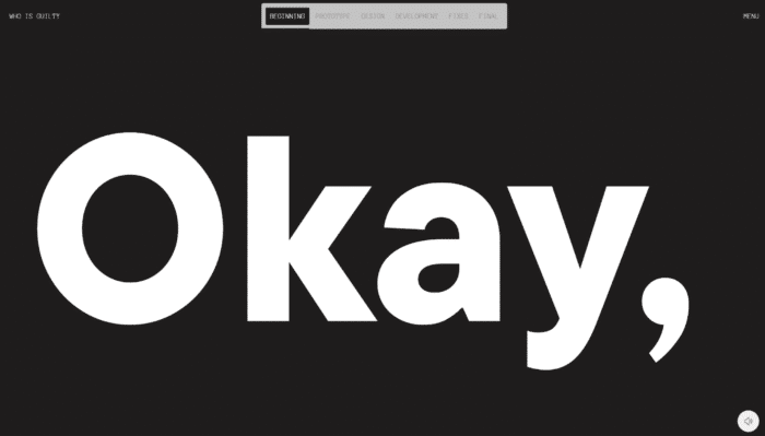
It features screens like this that use minimal text – just one word in this case – for maximum impact. It’s unusual and arresting. There’s a purity and simplicity that helps tell the story – here, in a meta twist, a story about a designer and a developer making a website. It speaks more directly to the user by mirroring the way stories and text are read aloud, rather than leaving them to navigate their way through a long sequence of paragraphs. And it allows the brand’s story to come through in high definition, more memorably, with less risk of being buried.
We also need to start thinking in terms of attention span rather than space. Wherever possible, it should be as undemanding to consume the content as possible. Expect little of the user but offer them a lot.
An easy mistake to make is cramming loads of information into your top-of-funnel web page. This essentially turns it into a datasheet or a one-pager – a rigid, limited space in which to get information across, rather than one you can extend and shape. Agencies are often told, “I need a website that has all this information on it”. But our job is often to recommend that what brands actually need is a beautiful, storyful website, from which your audience can be sent on appropriate buying journeys.
You can only really achieve this kind of storyful website when copy and design work in tandem. But writers, designers and developers often join a web project at different phases, without connection. Teams can also be constrained by needing to fit into a rigid CMS that restricts freeform, fluid, genuinely intuitive web design.
And then there’s the mindset shift required by brands’ stakeholders who might assume they’re getting less bang for their buck because they see less text and “wasted space”. Everyone needs to be onboard in the process of saying a lot with a little.
Storytelling that goes for a scroll
Brand storytelling is, at its heart, about a journey. From problem to solution. From confusion to clarity. From blindspot to insight. From one way of doing something to another. One of the fundamental ways we guide users along a journey on a website is with the scroll. Yet it’s one of a designer’s most underestimated, underutilised tools.
How often do you encounter a website where you don’t just scroll from top to bottom, receiving information in an expected way? Horizontal scrolling therefore immediately creates surprise. The scrolling direction may even change part way through the web page to clearly separate a subsection or point of interest in the story. In the case of “Who is guilty”, it’s as simple as charting the chronology and passage of time in the web build process.
Conventional wisdom dictates you need to give users the information they’re looking for before they leave. But it doesn’t hurt people to scroll. They will move through a webpage if you engage them, hook them in and tell the story well. Giving users the option to take a shortcut and jump to different sections allows them to take it at their own pace, too.
You can even combine a scroll with a text transparency effect, as demonstrated by Iceberg and AI takes over below, to guide the reader – again, like classic storytelling.
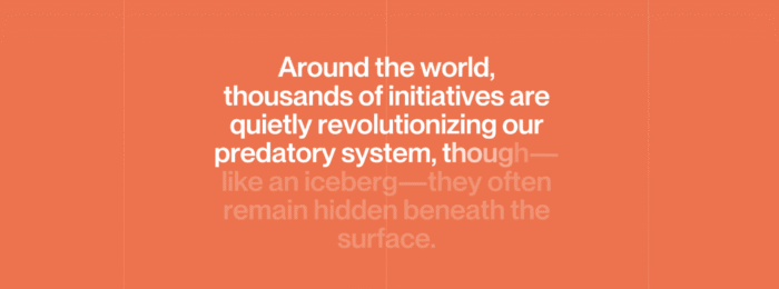

The scrolling speed itself can enhance the web experience. The “Who is guilty” website uses it to playfully reflect the frenetic chaos of the website development process. Accelerating or decelerating can also pull focus on a certain element of the story or help explain a complex concept.
A quick recap to help improve your B2B designs:
|
These storyful tricks aren’t the optimal approach for every website or web page, of course. Users who are already engaged and visiting your site for details will want them fast and hassle-free. But before you’ve captured your audience’s attention, your goal should be to make them want to spend time on your website. These design and copy approaches can help you get there.
Does designing storyful webpages still sound like a bit of a challenge? Talk to us about how we can help.