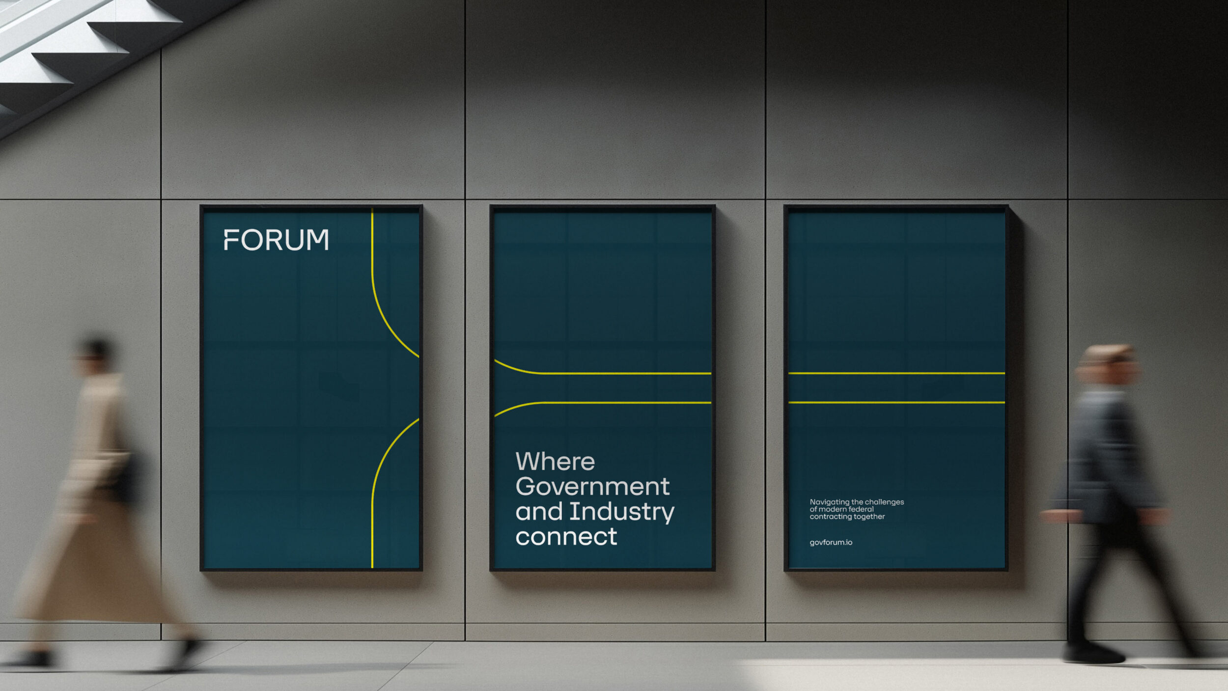
A B2B and B2G brand transformation
Client
FORUM
What we did
Brand strategy, positioning and story
Brand visual identity
Story-led design
The US federal contracting sector is full of opportunity for government agencies and private businesses to collaborate on important projects. But it’s a notoriously difficult space for businesses to break into – with complex rules, paperwork and processes.
And for US government leaders driving agency missions – from responding to international emergencies, to building infrastructure, to defending the country – partnerships with trustworthy contractors are becoming ever-more critical to success.
MileMarker10 and its family of brands (FedHealthIT, G2Xchange and more) established itself as an ecosystem in which public and private-sector leaders can come together, share insights and create ongoing working relationships. Its events, content and digital platform have become invaluable to the federal contracting space.
But the time came for the brands to be rationalised and refreshed, to create a simpler, stronger platform for the next stage of growth. We worked with the MileMarker10 team on an initial three-month project covering brand strategy, naming, narrative and identity – a total brand transformation.
A brand re-architecture
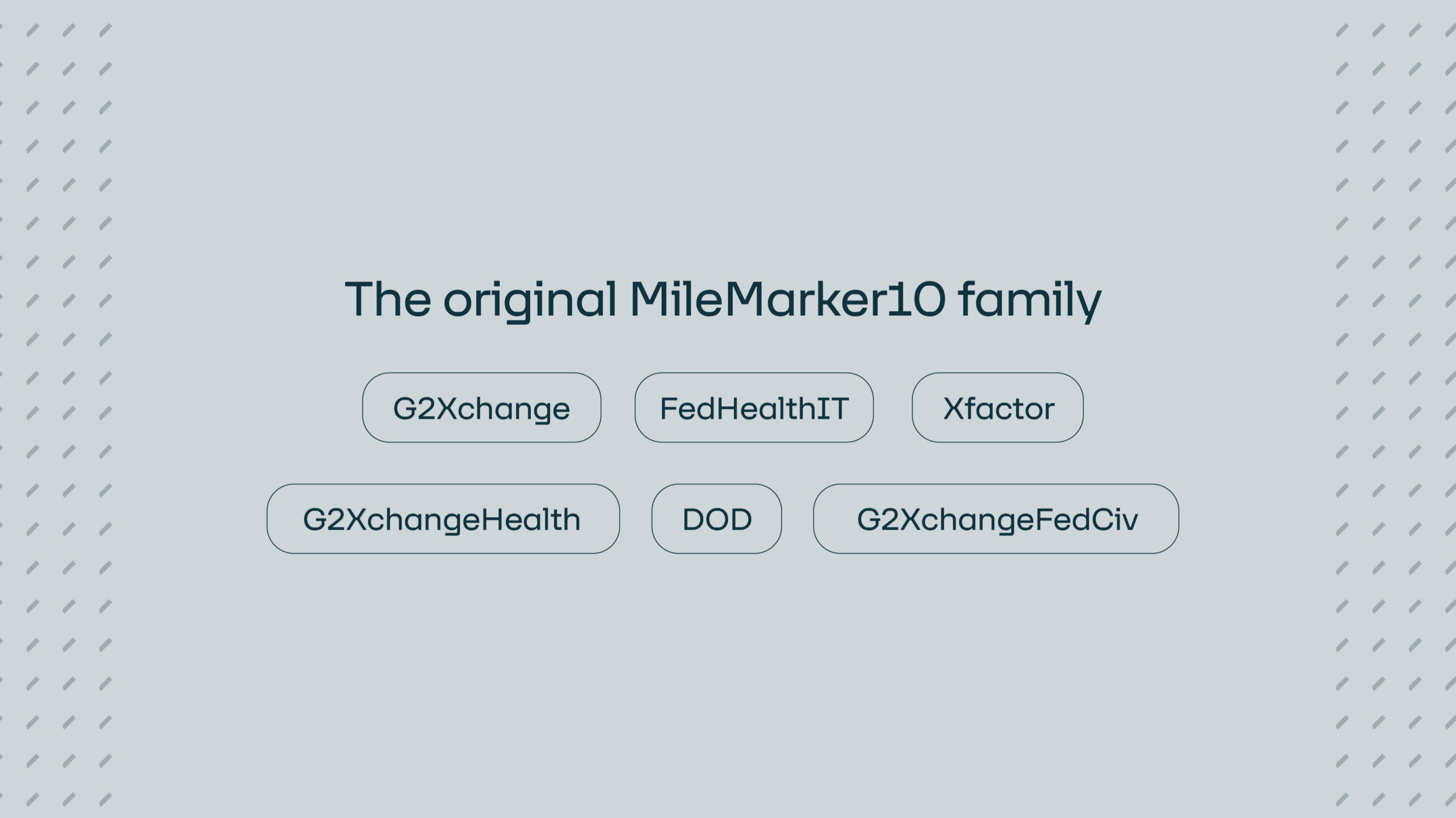
Over the years, organically and through acquisition, MileMarker10 became a parent brand to the multiple sub-brands shown below, as well as an expanding variety of products, services and events.
Given that a big part of what it sells to its audiences is simplicity in a world of contracting complexity, that simplicity needed to be embedded in its brand offering. One of our first tasks would be to re-organise these entities into a clearer structure to support its vision for the future.
A new name, positioning and story
FedHealthIT and the other brands in the family had a reputation for putting on big-hitting, high-energy events, and the team brought the same mix of passion and smarts to our collaboration.
Together we forged a plan to rationalise the parent brand and multiple entities down to two: one brand for events, resources and thought leadership, and another brand for a subscription-based contracting data product (story to come, once it launches).
For the new parent brand, an opportunity made itself clear: to capitalise on a vivid sense of place and coming-together. That’s how MileMarker10 and FedHealthIT came to be one new brand:
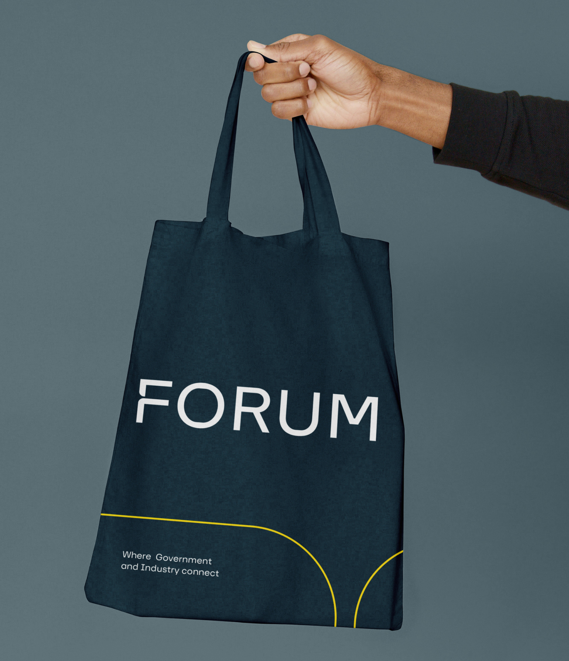
FORUM: where government and industry connect.

The FORUM brand
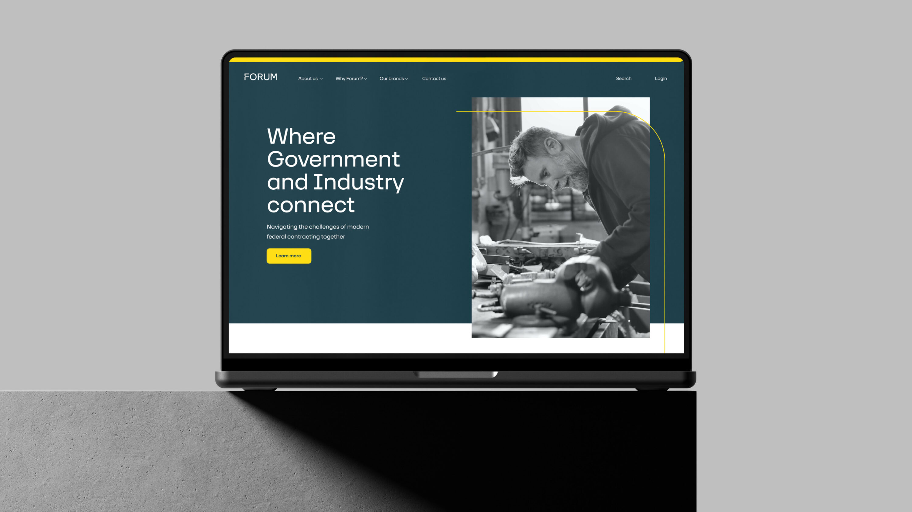
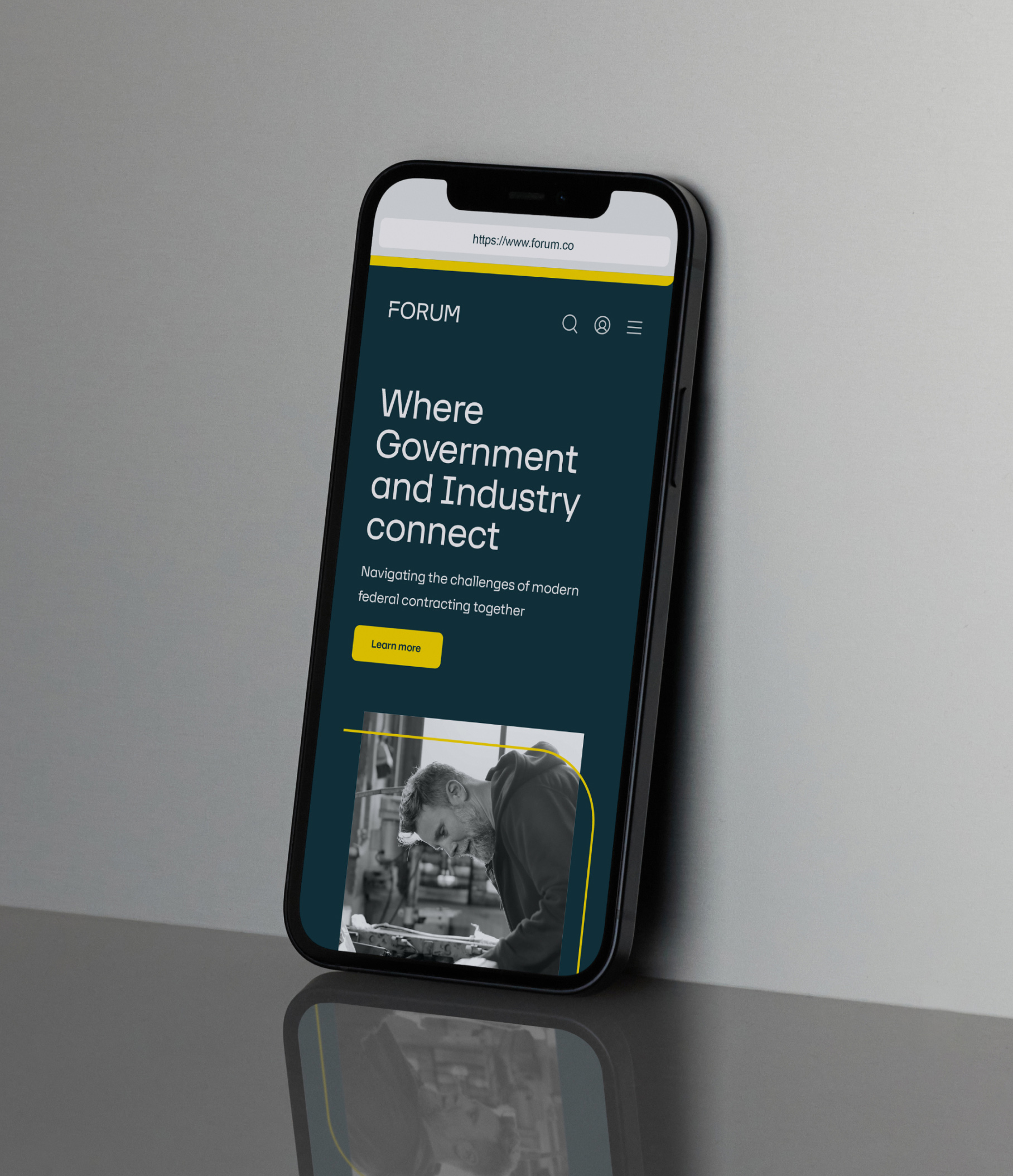
With a new name and positioning agreed, the next step was to develop a brand identity to help FORUM tell its story and communicate its central position in the federal contracting industry.
We needed to create a system that would accommodate events, sister brands and any new products that might become part of the FORUM family.
Following a design workshop, where we took a deep dive into the existing design system, analysed competitors and explored opportunities, we outlined and presented a variety of initial design routes for further development.

A scalable design system
Armed with FORUM’s chosen route, we set about creating a flexible and scalable design system to meet the brand’s future needs.
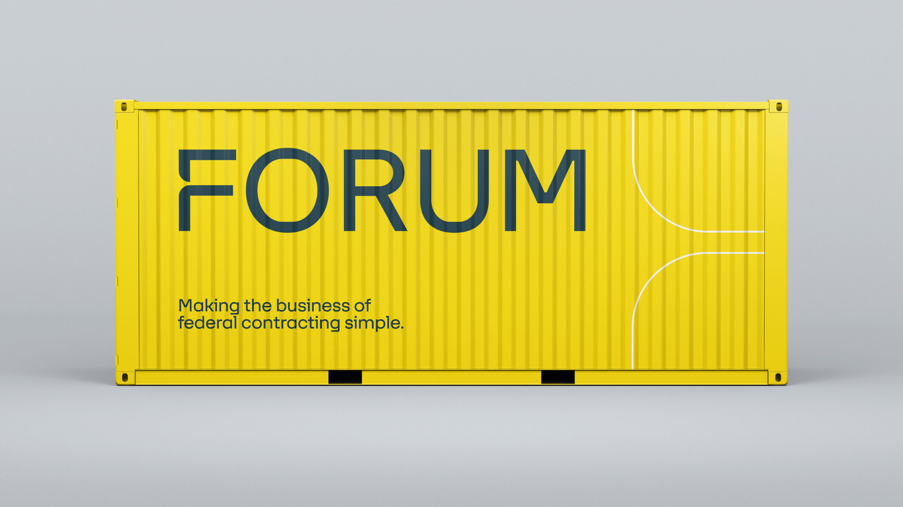
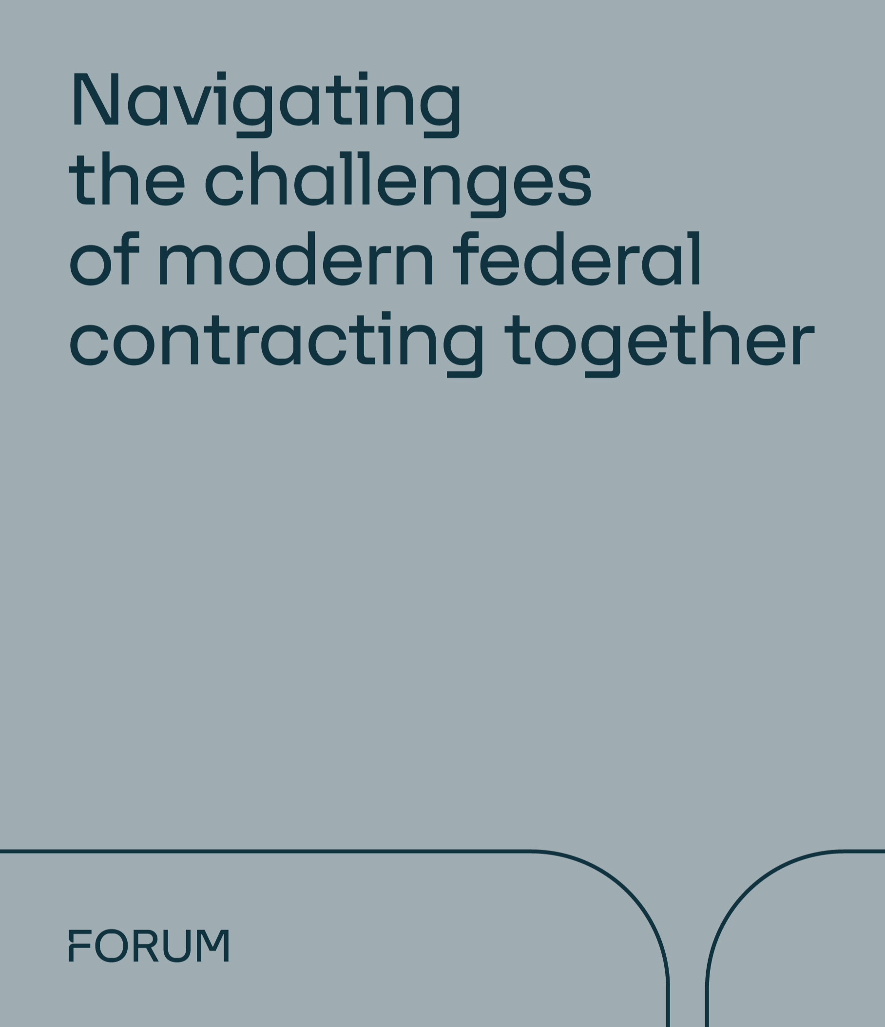
The logo was the first point of call. The unique treatment of the ‘F’ was designed to simply and subtly evoke the notion of connection or intersection to support FORUM’s brand tagline. That graphic treatment can be used throughout the rest of the visual identity, as either a standalone element or a framing device.
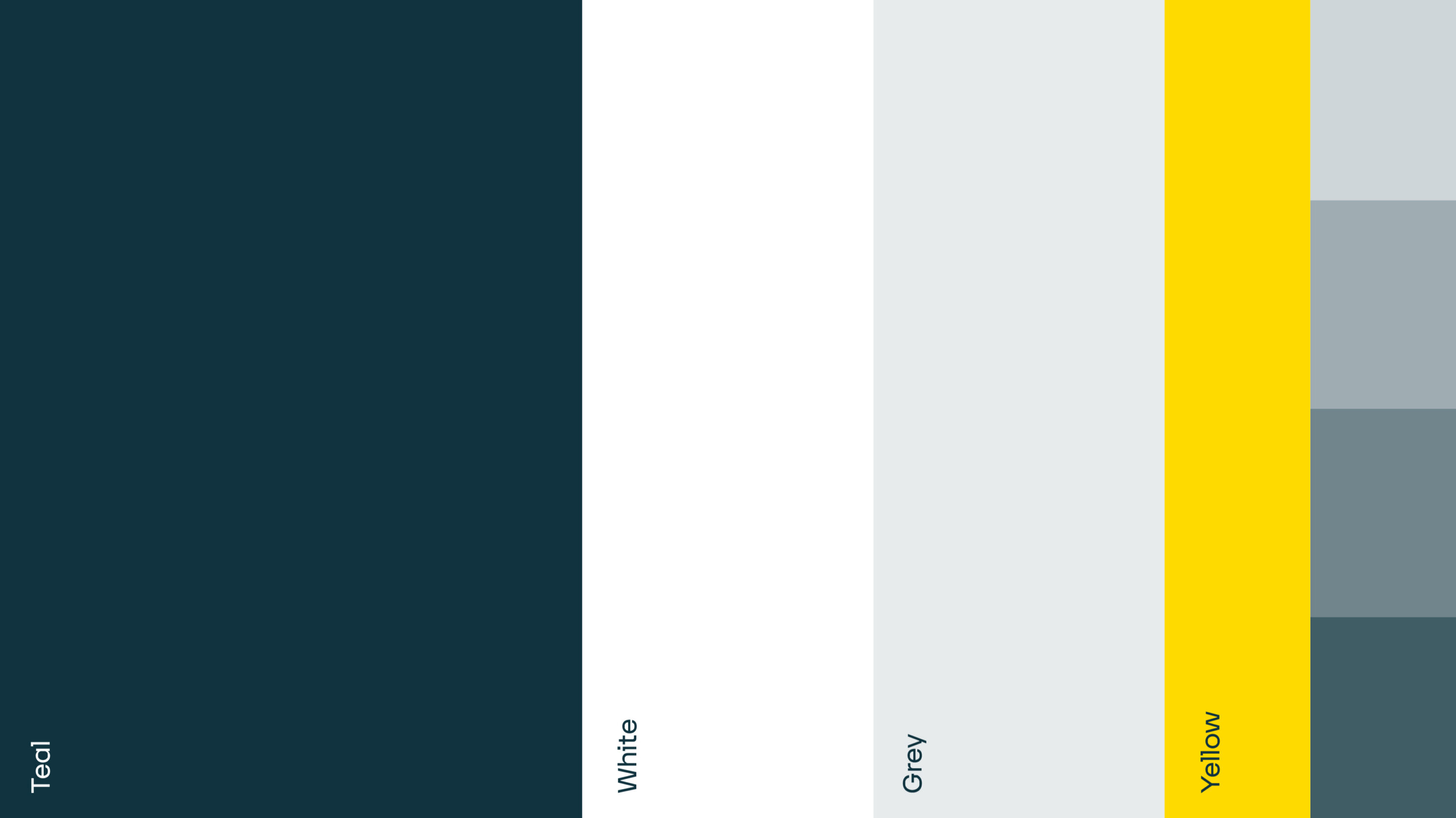
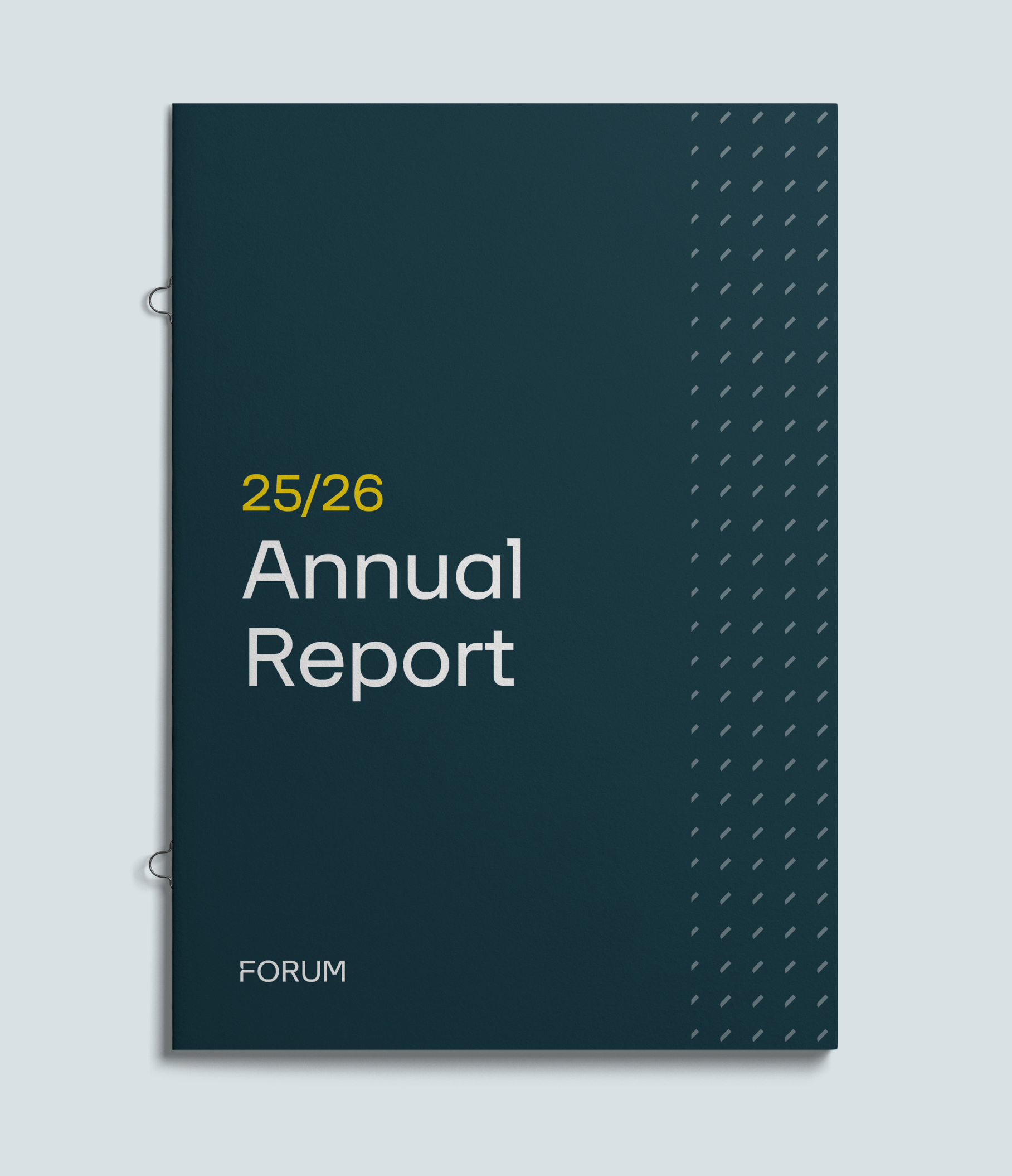
In addition to the logo, we selected Foundry 37’s Lineca as the overarching brand typeface, bringing a sense of contemporary authority which feels appropriate for the sector. We established a fully accessible colour palette that is rigid enough to ensure consistency, but can also be expanded for sub-brands and events.
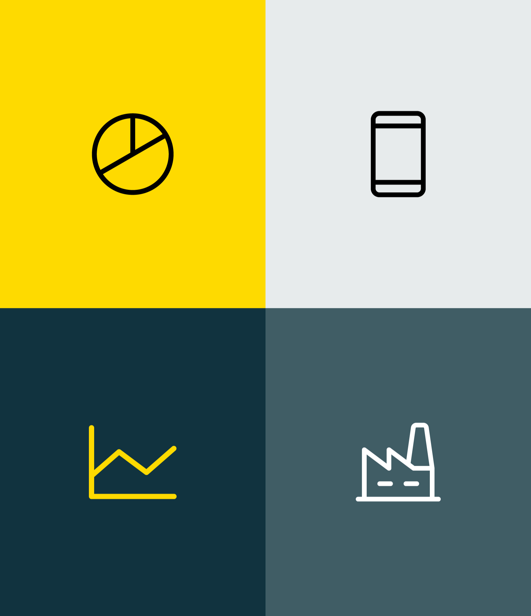
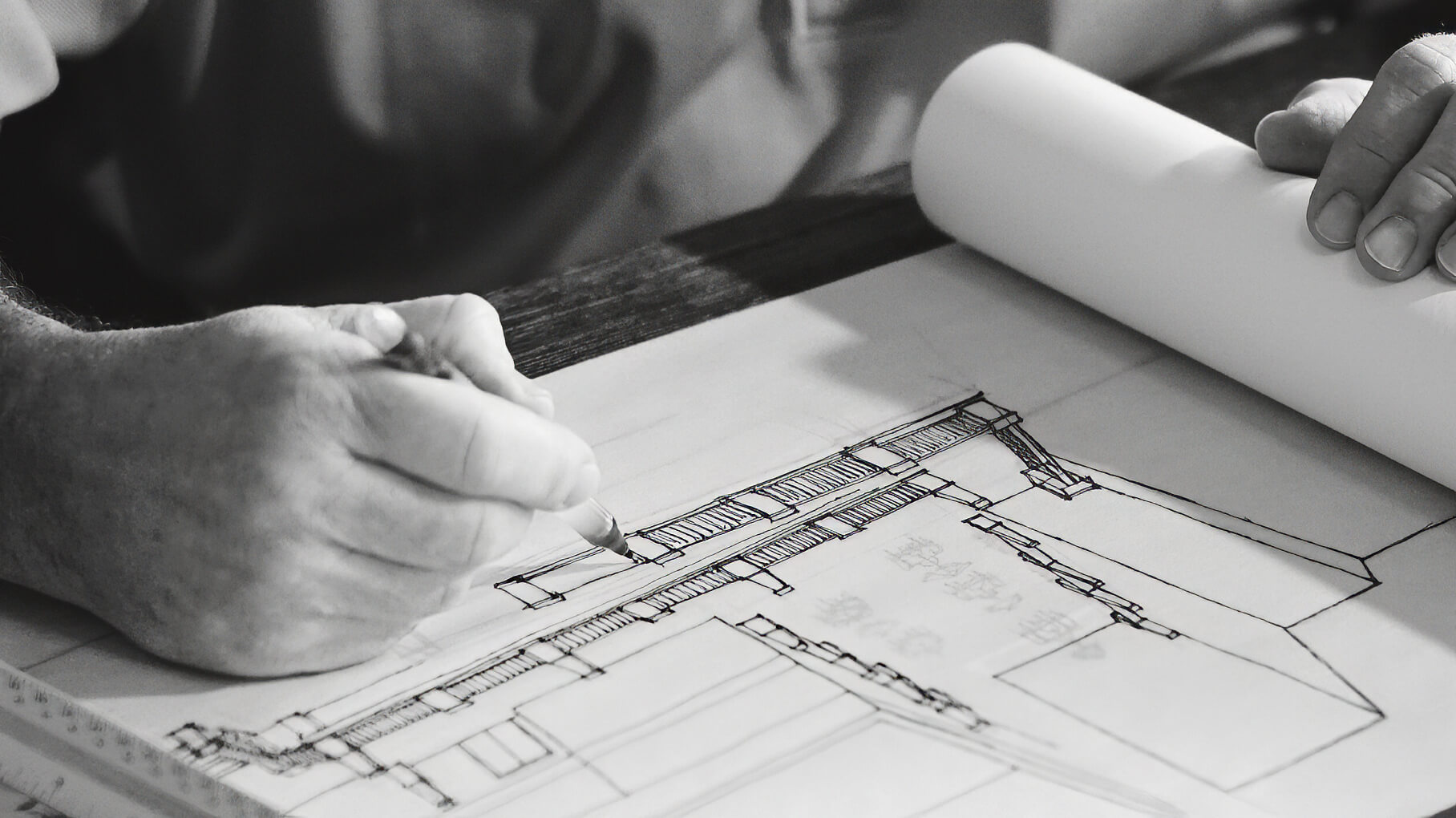
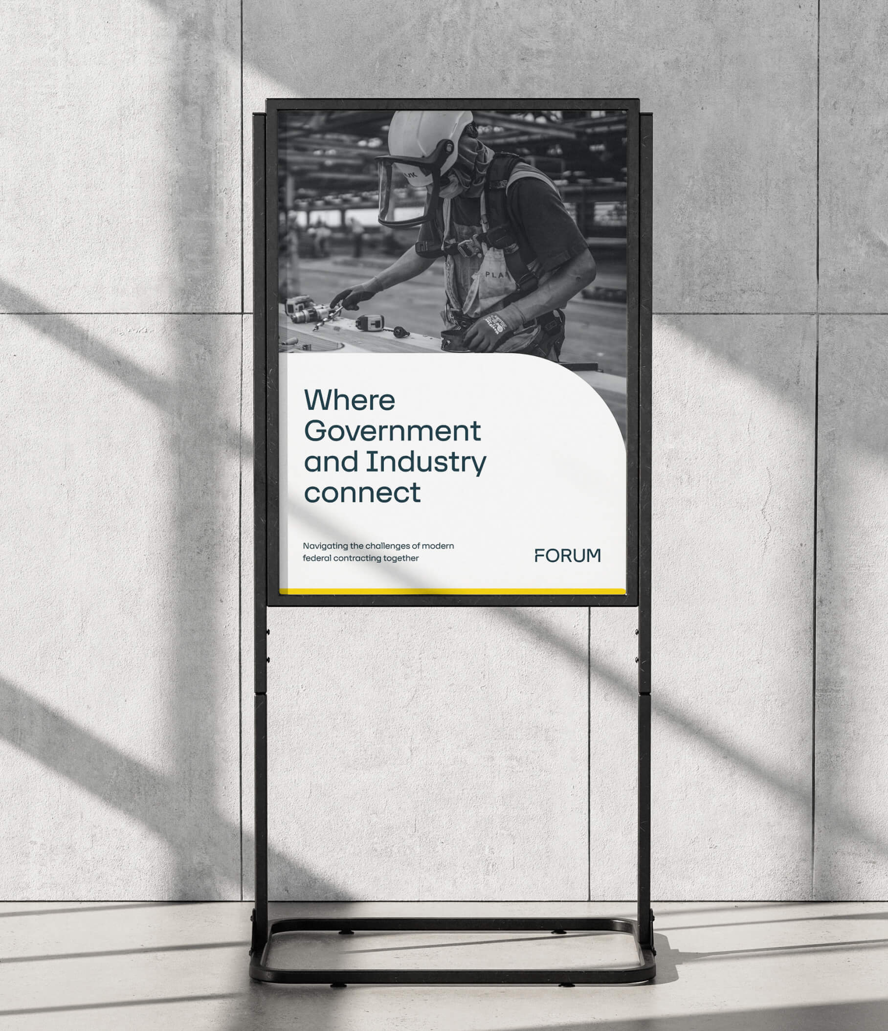
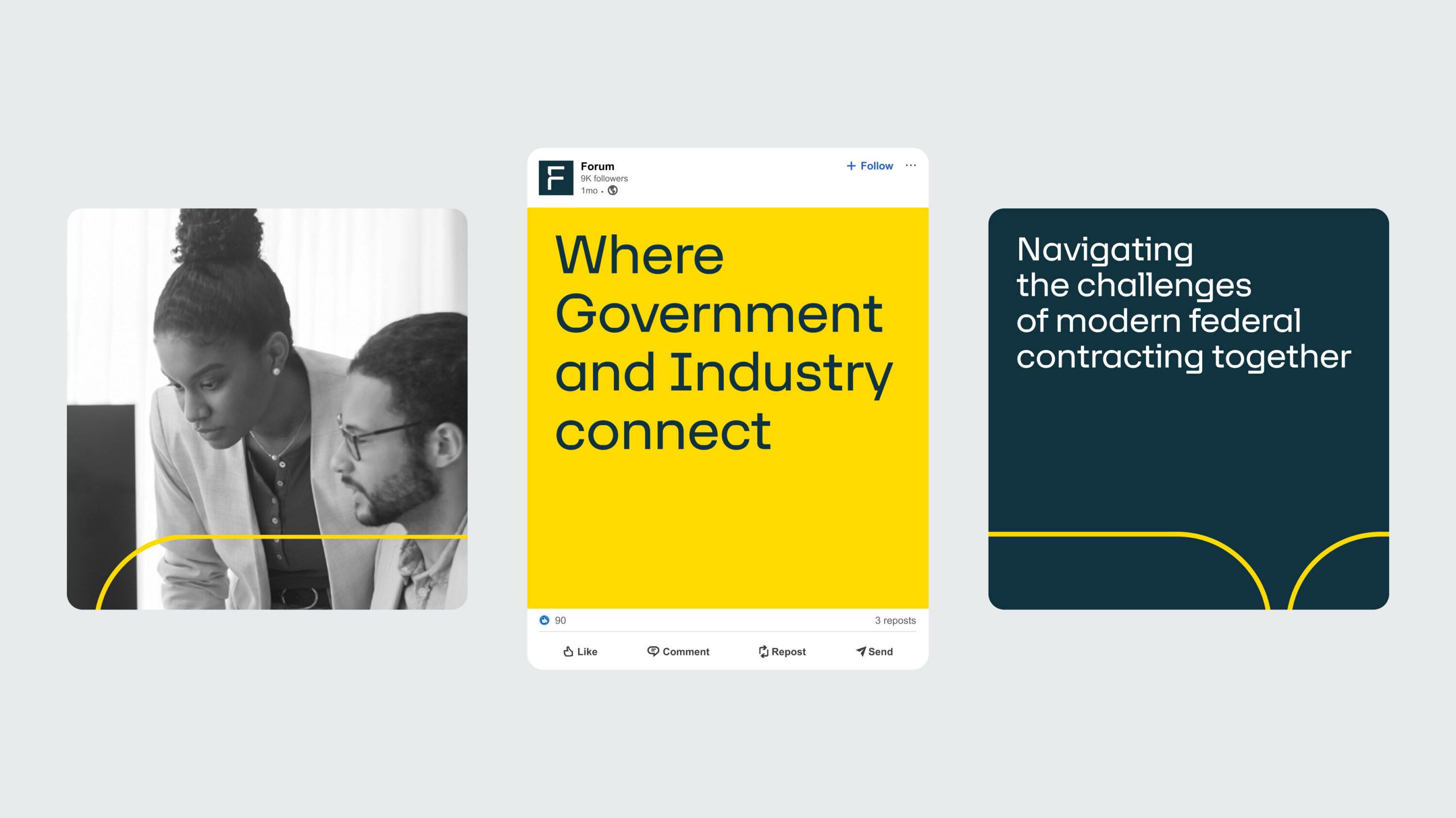
We also developed a human-centred photographic style, with a variety of categories for any subject, and an easy-to-execute icon style that is flexible enough to communicate complex concepts.


Simplicity powers consistency
One of our key principles throughout the design rollout was to achieve a radical simplicity that would make it incredibly easy for FORUM’s internal team to deploy the new branding across the business and ensure brand coherence.
We believe the new identity for the FORUM family not only solidifies their position as industry leaders today, but will support them as their offering expands into the future.

Testimonial