Avolution: Rebranding and positioning a software company post-investment
Client
Avolution
What we did
Brand positioning
Brand narrative
Messaging
Brand visual identity
Avolution is a global, Sydney-based company that’s been setting the standard in data-driven and diagram-driven Enterprise Architecture software since 2001.
Following a strategic private equity investment, Avolution came to Beneath for positioning, messaging and branding support to help accelerate its growth even further.
Research and analysis
Our work began with an extensive discovery and research phase in which we analysed the EA market and Avolution’s place within it. We trawled everything from analyst reports, competitive intelligence, user reviews and case studies – to web analytics, win/loss data, customer health scores and competitor messaging.
Positioning, messaging and story
Equipped with an understanding of the ICP, their needs and pain points, we were able to develop a new positioning and story to help Avolution focus its sales and marketing around real customer issues.
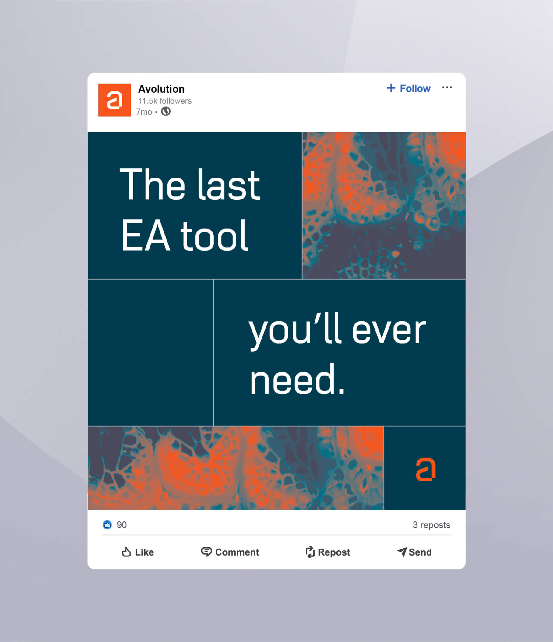
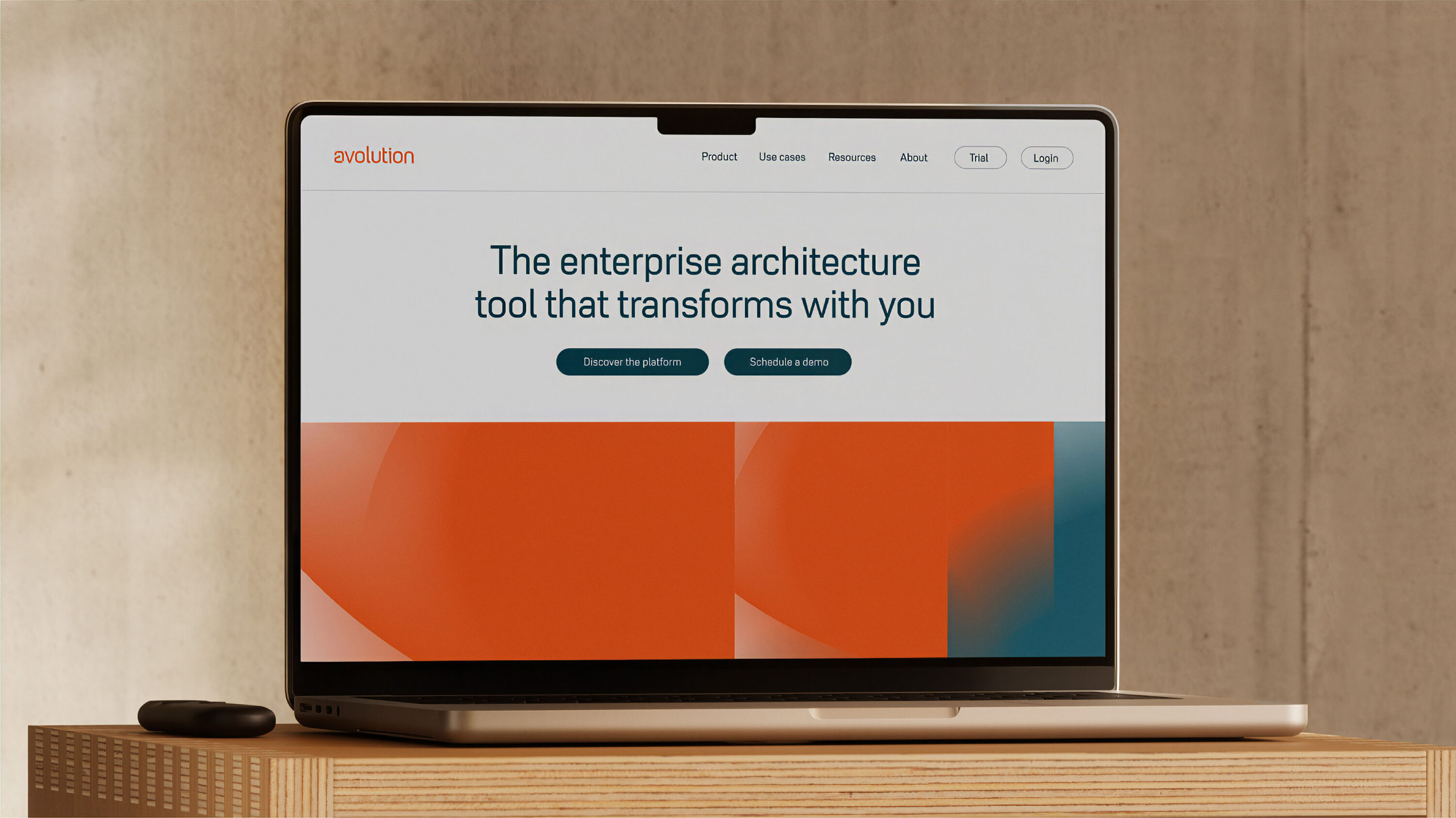
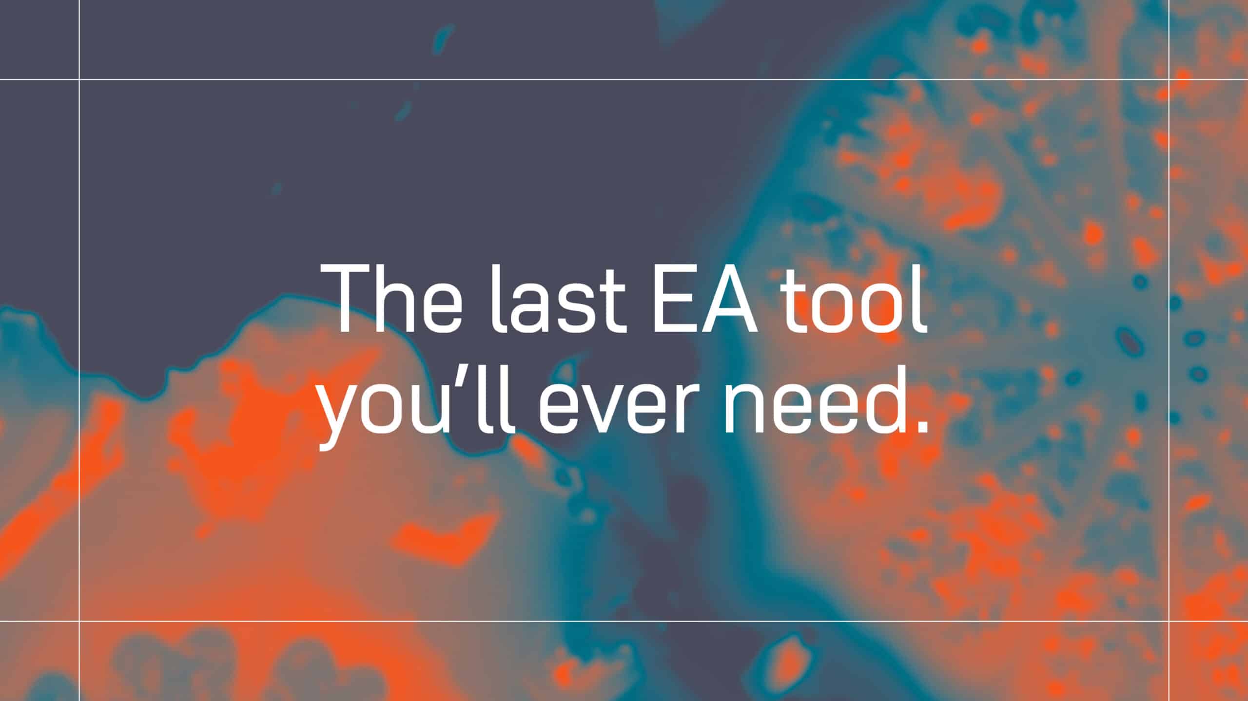
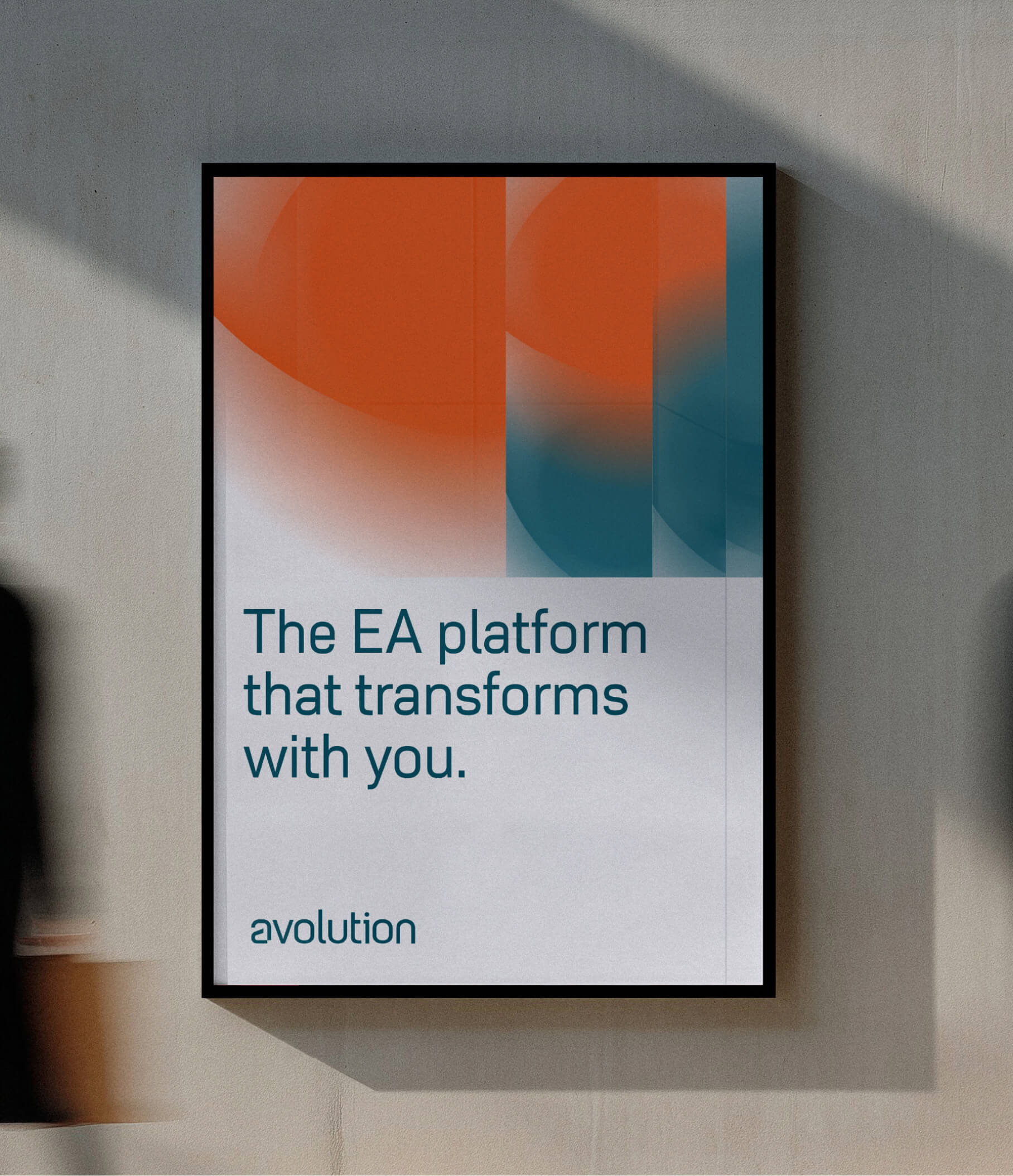
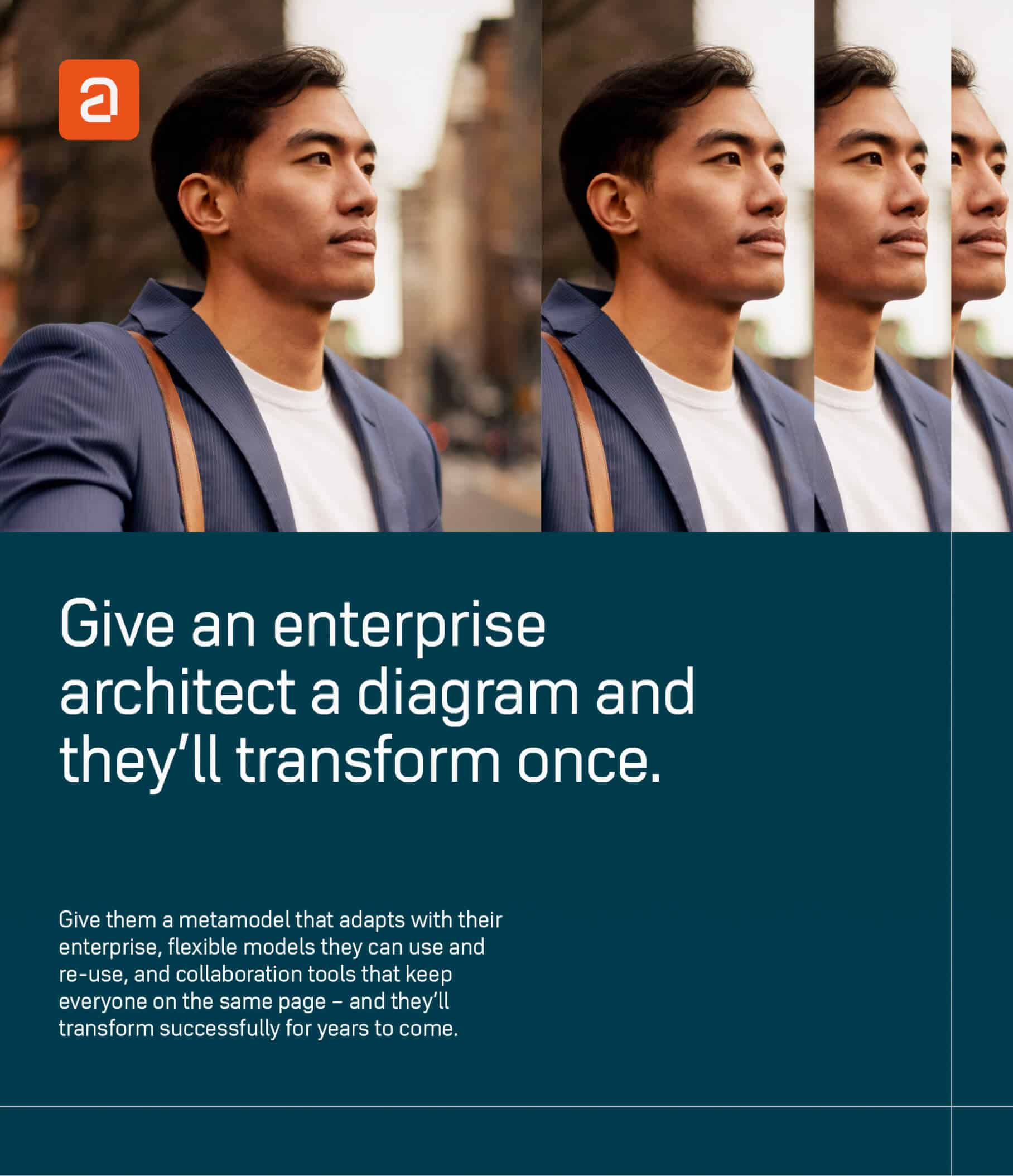
As “the enterprise architecture tool that transforms with you”, Avolution becomes the last EA tool you’ll ever need. (Our research taught us that customers would often hit a ceiling with competitive tools.) With Avolution, they can start with a priority use case like application portfolio management, and never hit that ceiling.
A new visual brand
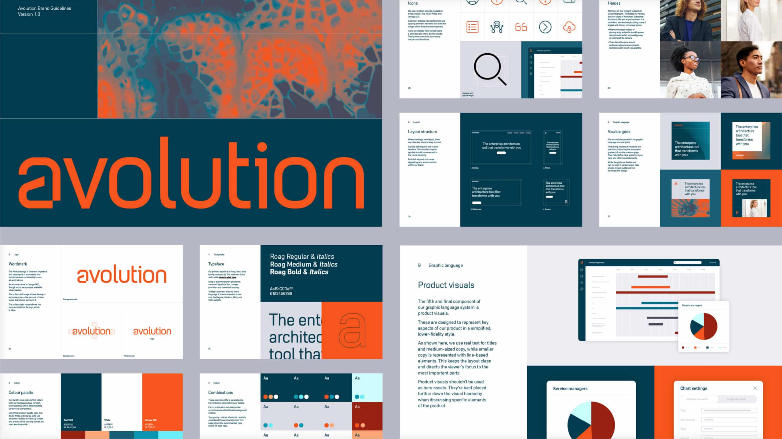
In parallel with the positioning and messaging work, we delivered a full visual rebrand to work hand in hand with the verbal rebrand. The goal was to create a stand-out, modern brand that still celebrated Avolution’s heritage. Our discovery, workshop and moodboarding process helped us make important decisions on:
Colour: refreshing and orange widening the palette to include a range of teal tints.
Typography: we chose Northern Block’s Roag for its personality, readability and distinctiveness in a landscape dominated by Grotesk sans serif typefaces. The rounded geometric forms of Roag also provided continuity with the shapes found in the original logo.
Logo: building on the typography improvements, we also created a custom lowercase ‘a’ that worked seamlessly within the wordmark while also standing confidently on its own and as a small avatar.





A new visual brand
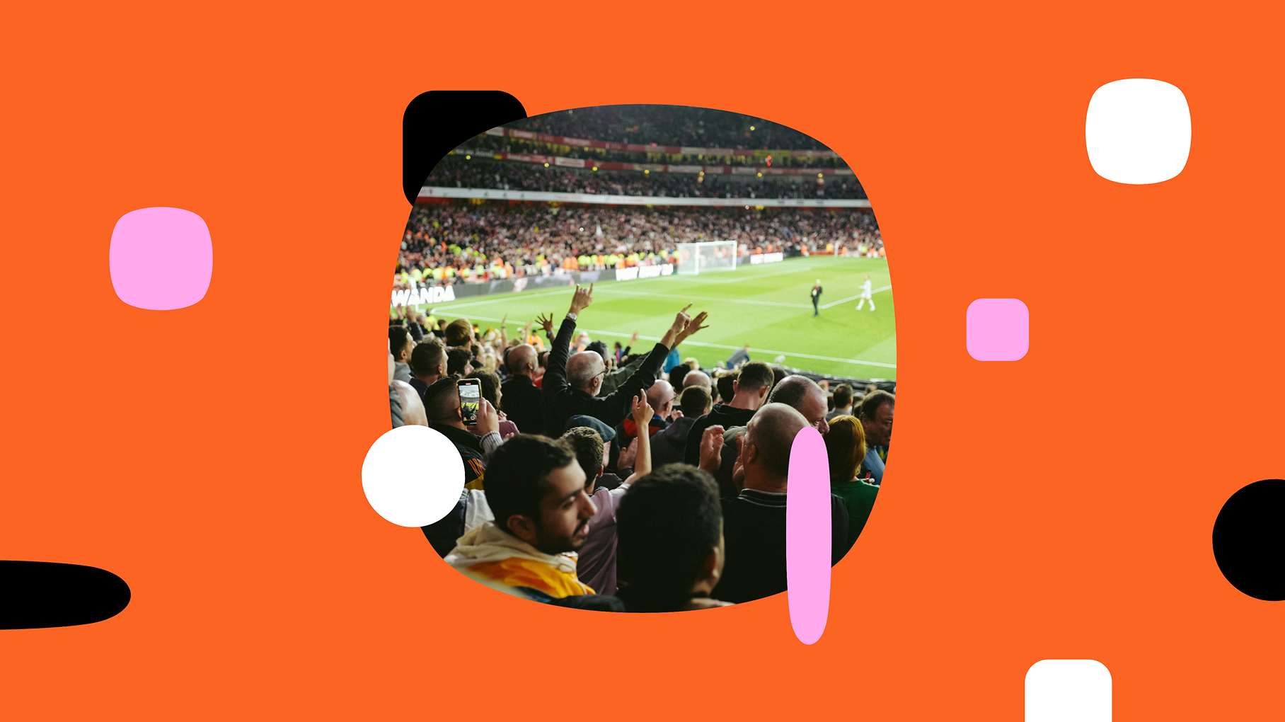
Visual language: a key visual element was the development of a distinctive gradient language, inspired by the central positioning theme of transformation. This could be used independently or combined with other colours from the palette.
Photography: a photographic treatment was developed to bring the Enterprise Architect into focus. Each image was given a warm grade to align with and complement the vibrant, orange-led palette
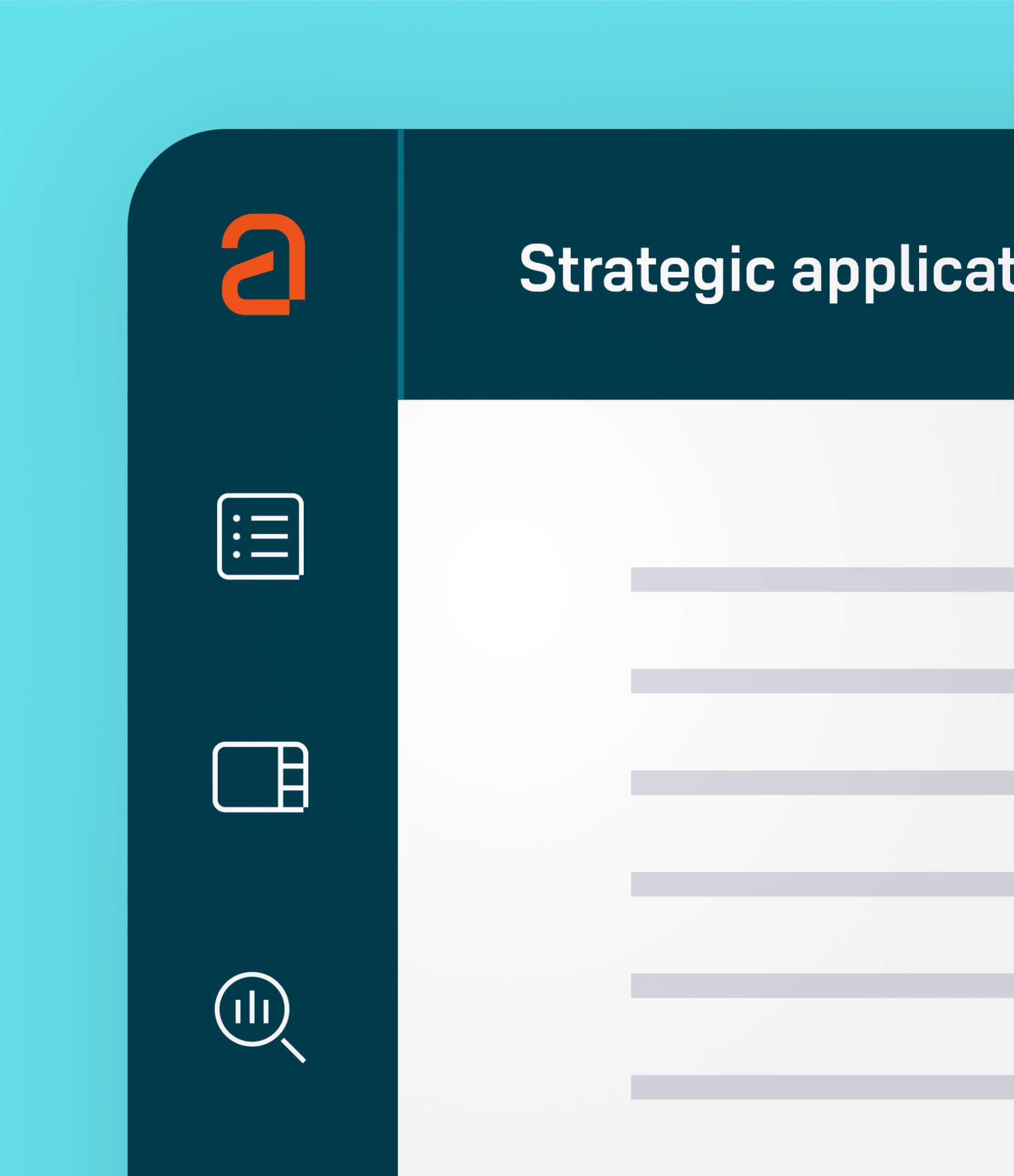
Iconography: we also created a bespoke icon set, drawing on the square notch removed from the lowercase ‘a’ symbol.
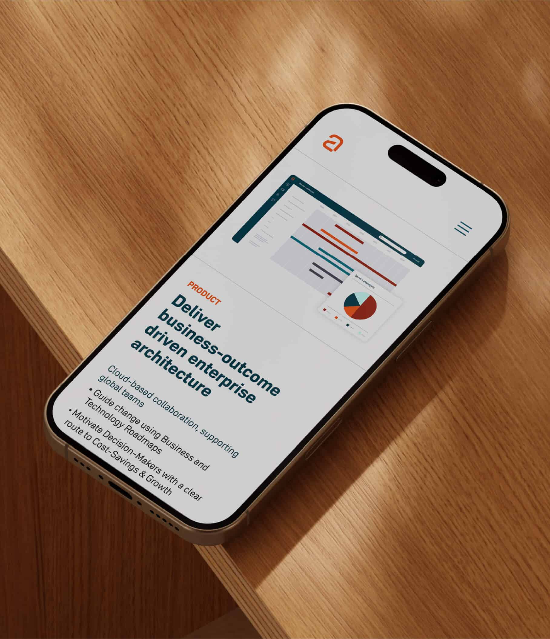
Illustrations: in addition, we developed a flat illustration style inspired by the data diagrams generated by Avolution’s platform.
Templates and guidelines: the new identity was consolidated into a comprehensive toolkit of brand guidelines and templates for the creation of presentations, social media assets, etc.
Animation: as part of the launch, we scripted, designed and animated a 90-second explainer video highlighting Avolution’s key benefits.