Squark AI: Rebrand for an AI-for-good startup
Client
Squark AI
What we did
Positioning, messaging and story
Brand visual identity
Design
Digital experience
Squark AI is the first AI platform purpose-built for nonprofit fundraising, offering predictive modelling to optimise campaigns, donor acquisition, retention and upgrades. After its acquisition by Market Holdings (a group of fundraising, marketing and media companies), it was gearing up to go to market. That’s when Judah Phillips and Chad Engelgau, the CEOs of Squark AI and Market Holdings respectively, contacted Beneath for help refining Squark’s positioning and messaging, and creating a whole new visual identity for the brand.
Verbal refresh
Tying product differentiators to valuable outcomes
Led by founder and visionary Judah Phillips, Squark was not short of messages. Our job was to bring differentiation, focus, clarity and impact. We began our usual process of discovery, collaboration and iteration. Through market, competitor and audience research, along with some creative experimentation, we helped Squark firm up its positioning, key messaging pillars, brand story and copy.
Visual reboot
A forward-looking brand that walks the talk
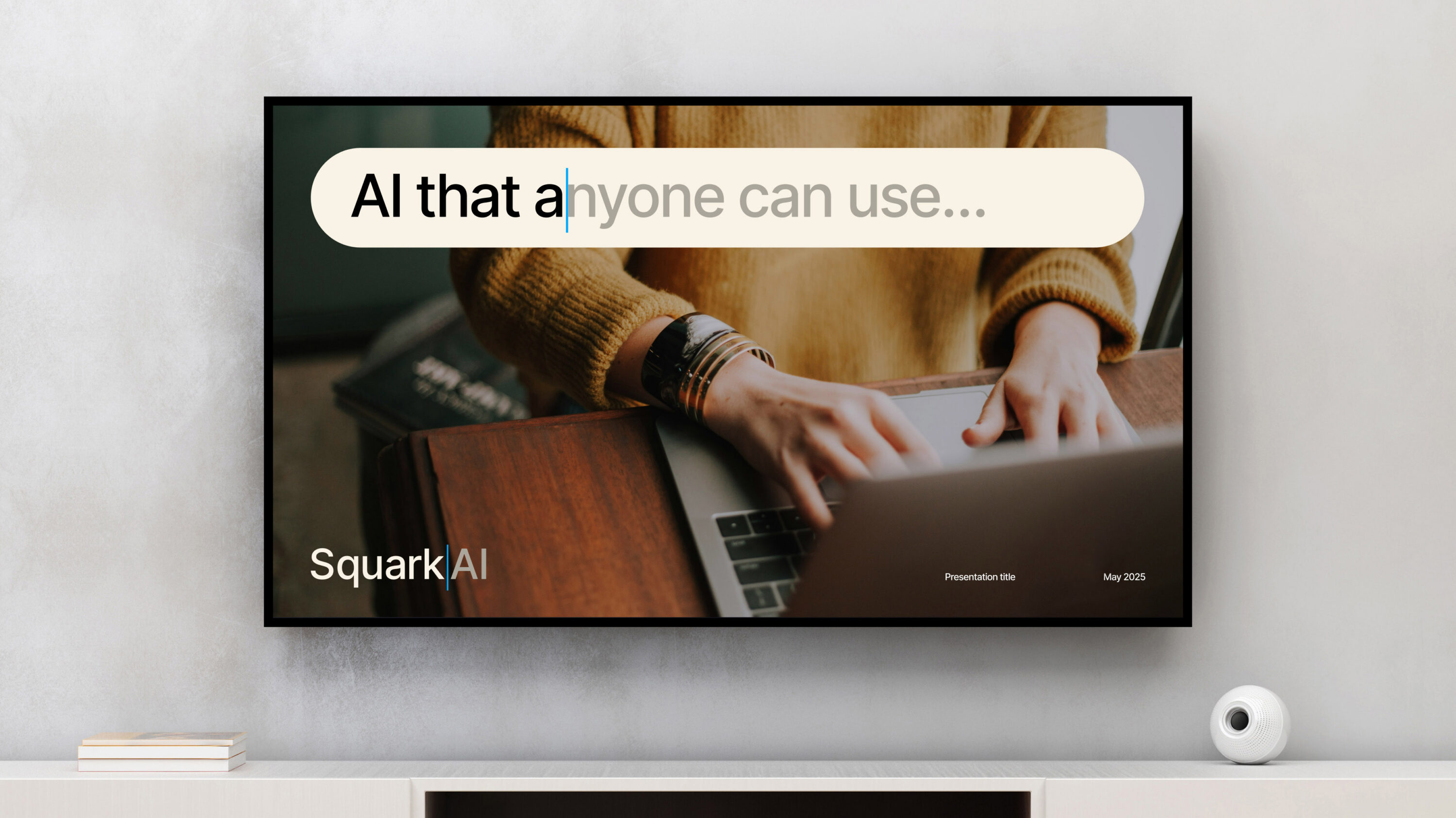
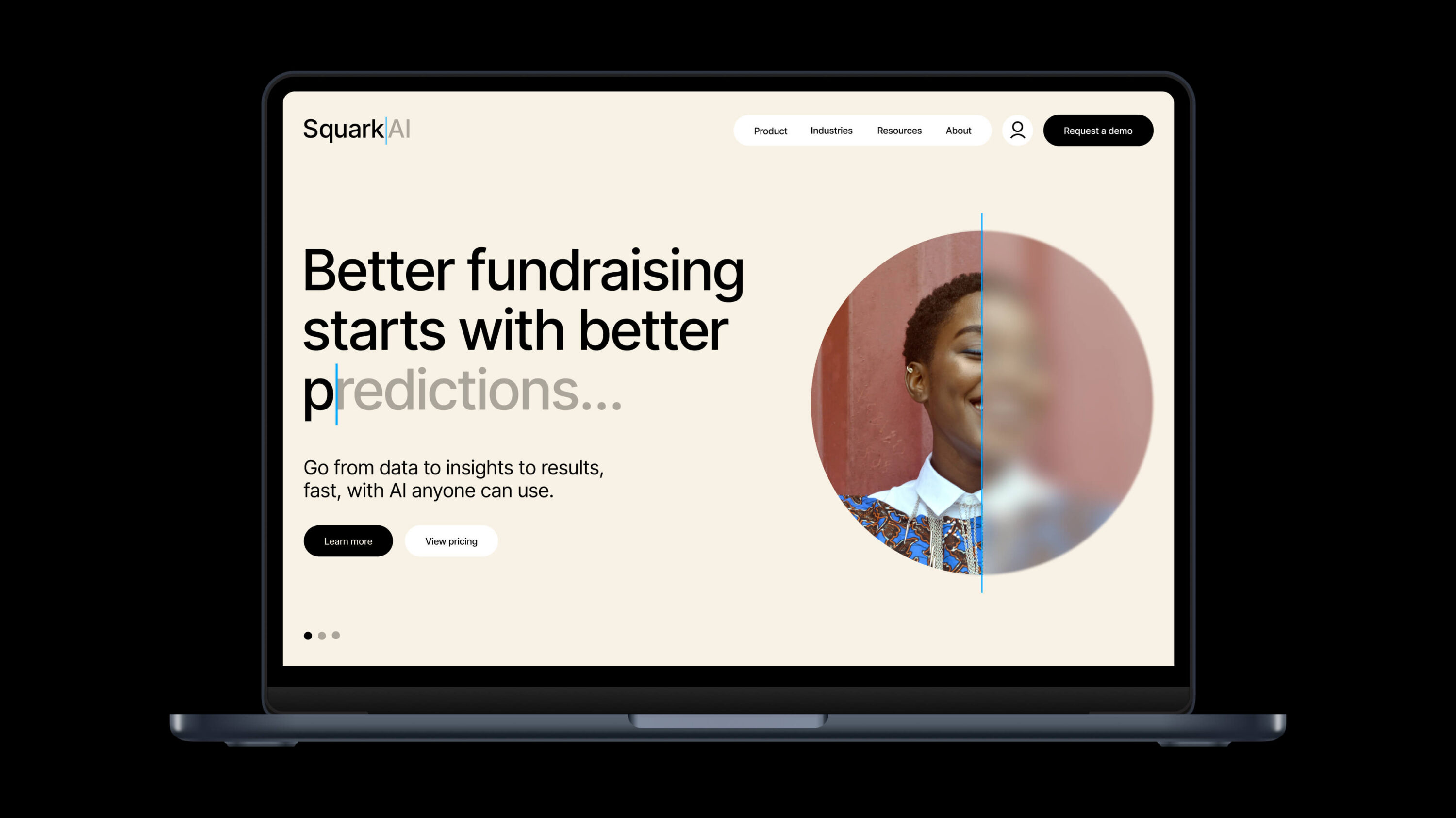
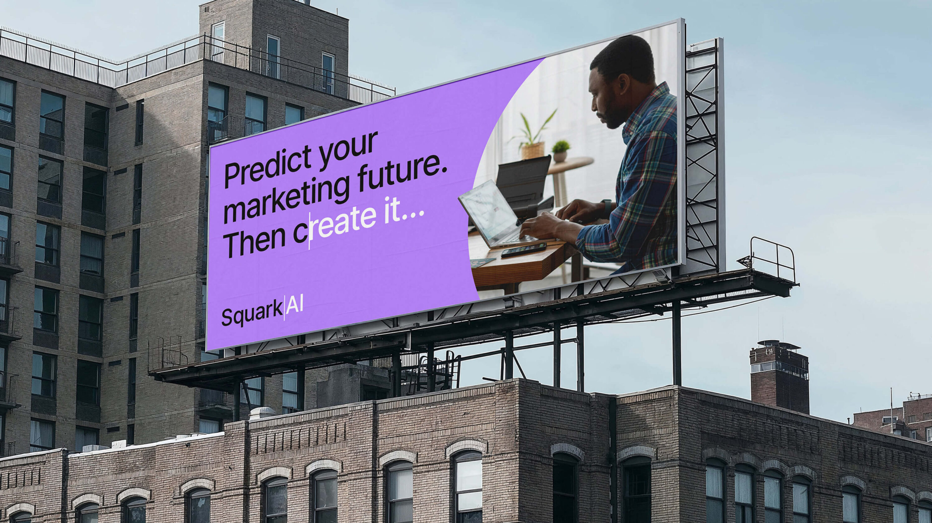
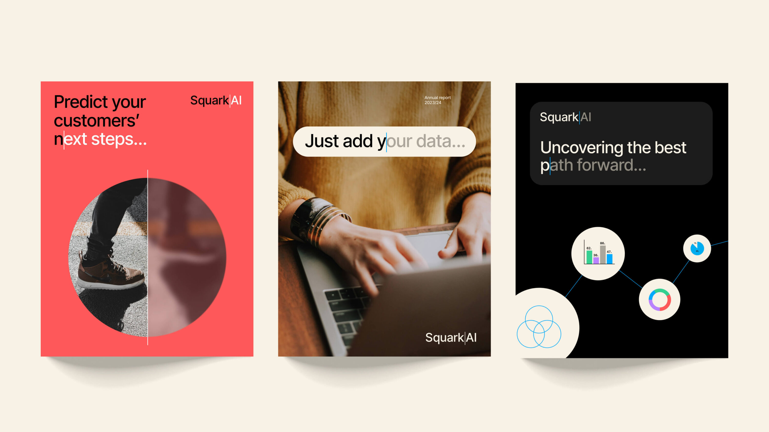
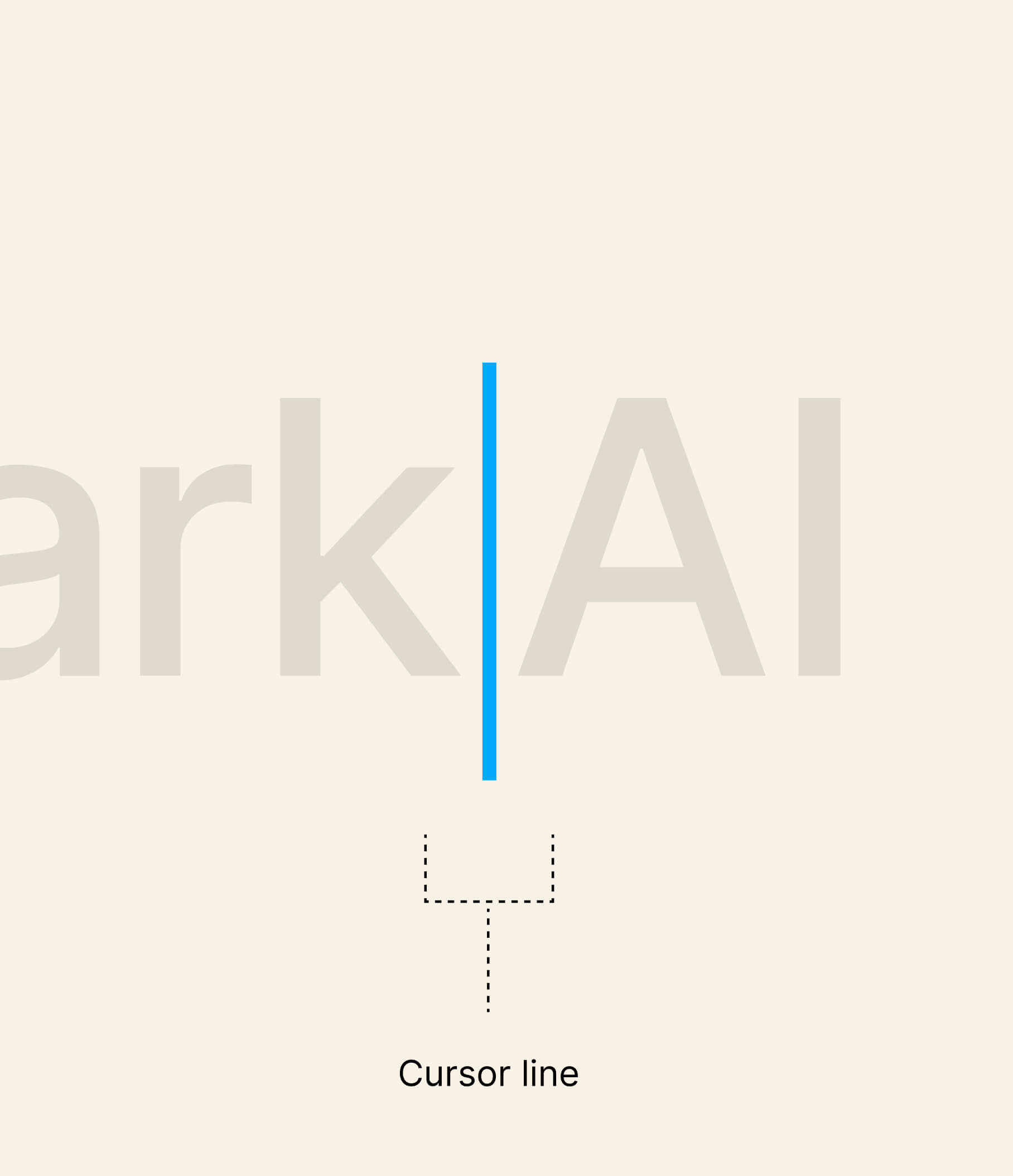
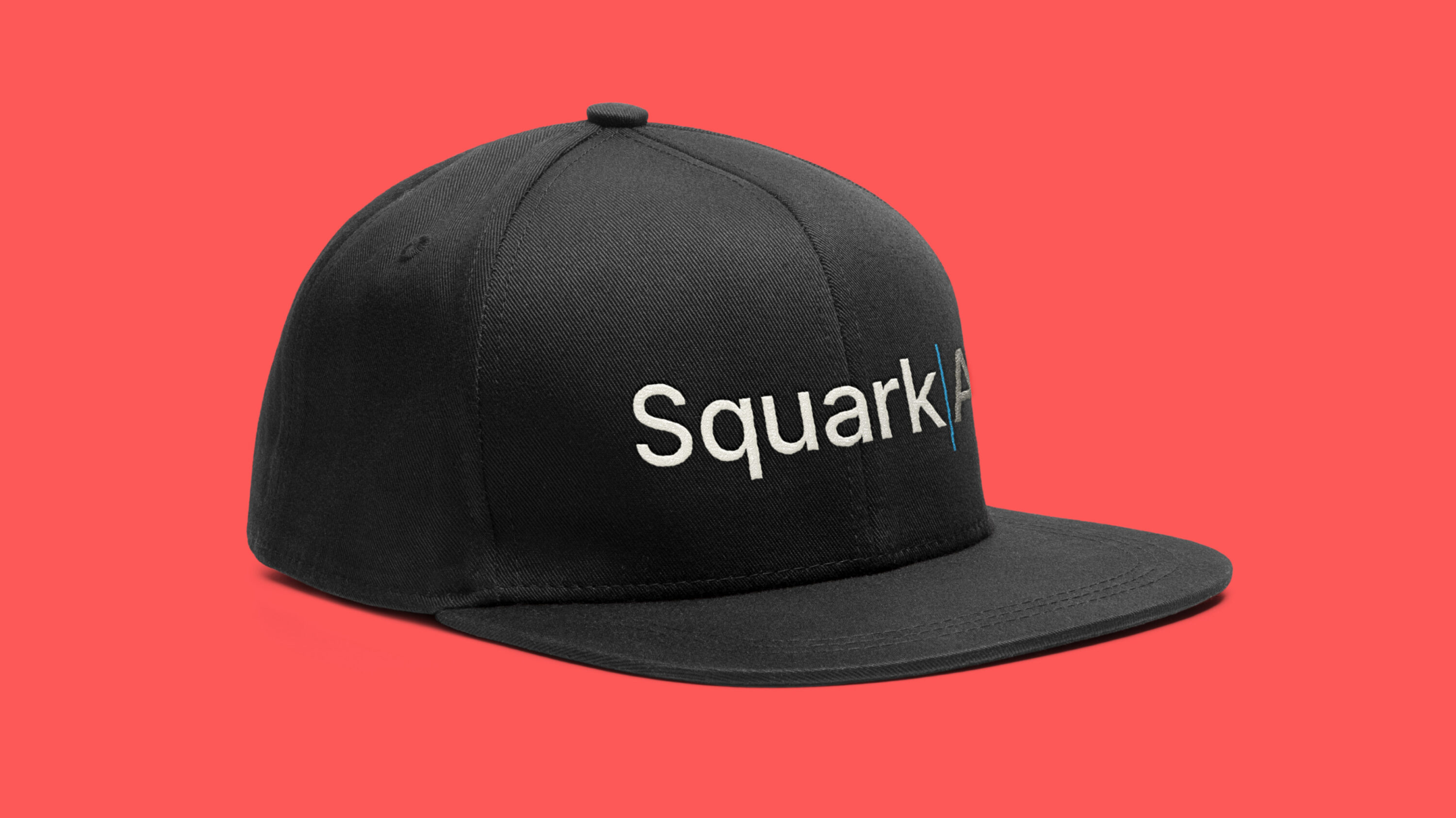
Squark helps nonprofits predict the future so they can anticipate their donors’ next moves and maximise the impact of their mission with fewer resources. So when creating a new wordmark and wider graphic language, our design team called to mind a predictive text input field, incorporating a blue “cursor” line, two tones of text colour, and the use of an ellipsis hinting at a predictable future for nonprofit customers. Sometimes the two halves of a visual and verbal rebrand click together so seamlessly, it’s hard to know where one ends and the other begins. Our work on the Squark AI brand felt like one of those times.

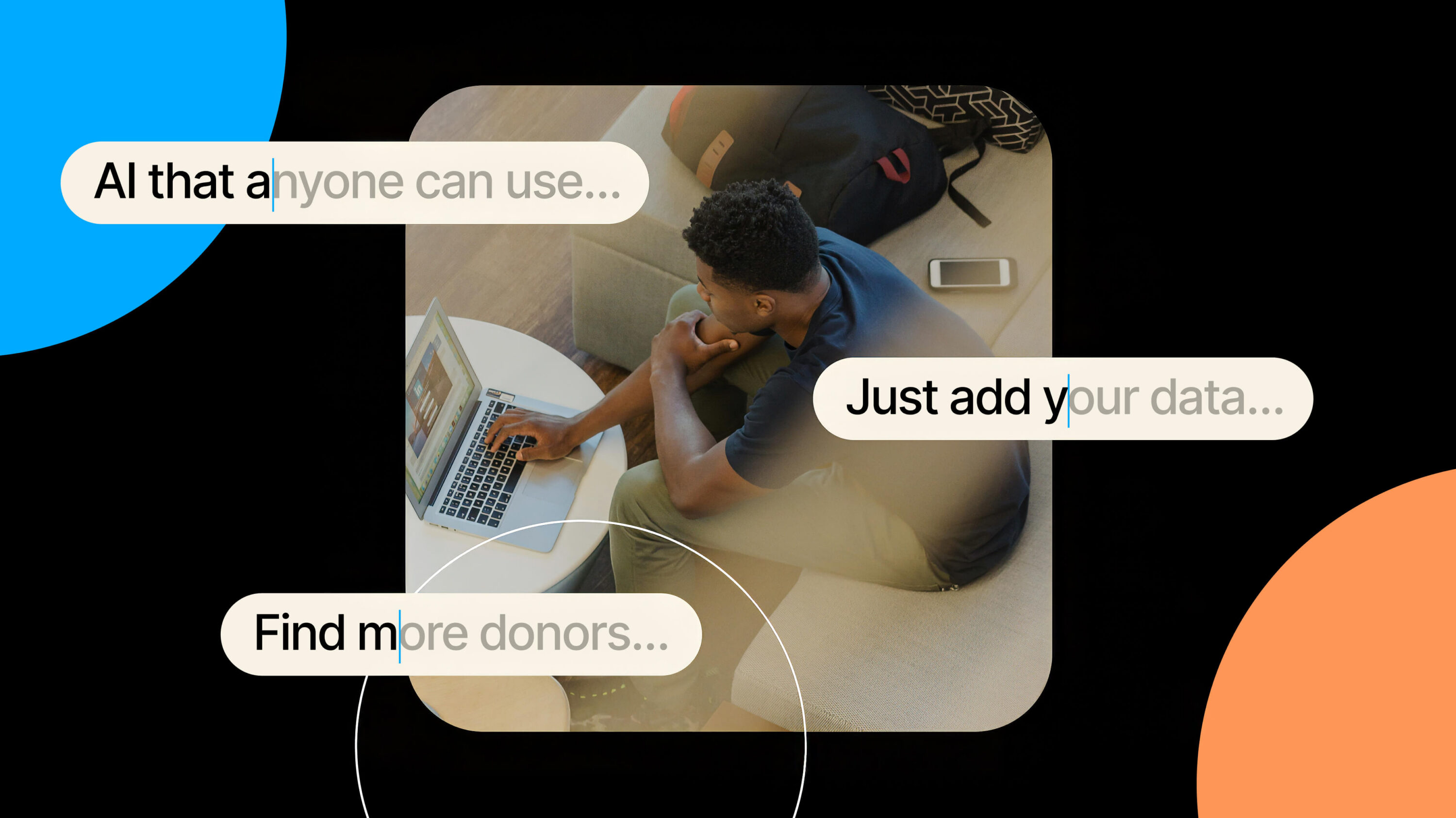

Visual storytelling that draws customers in
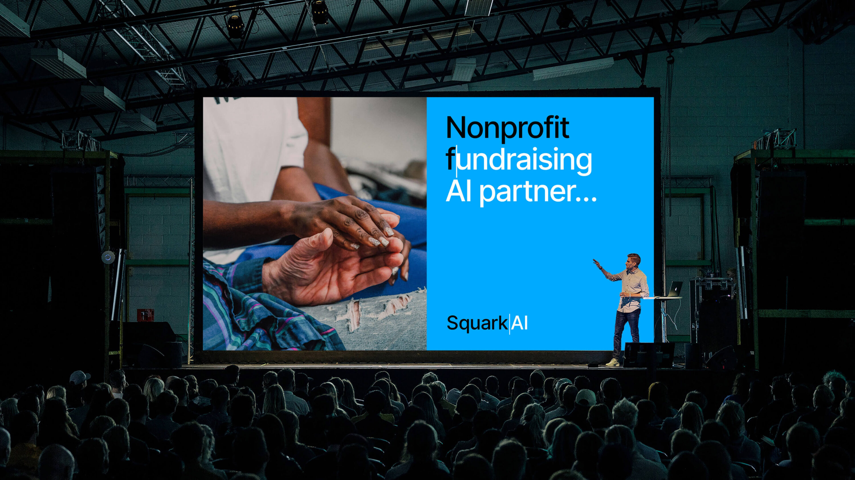
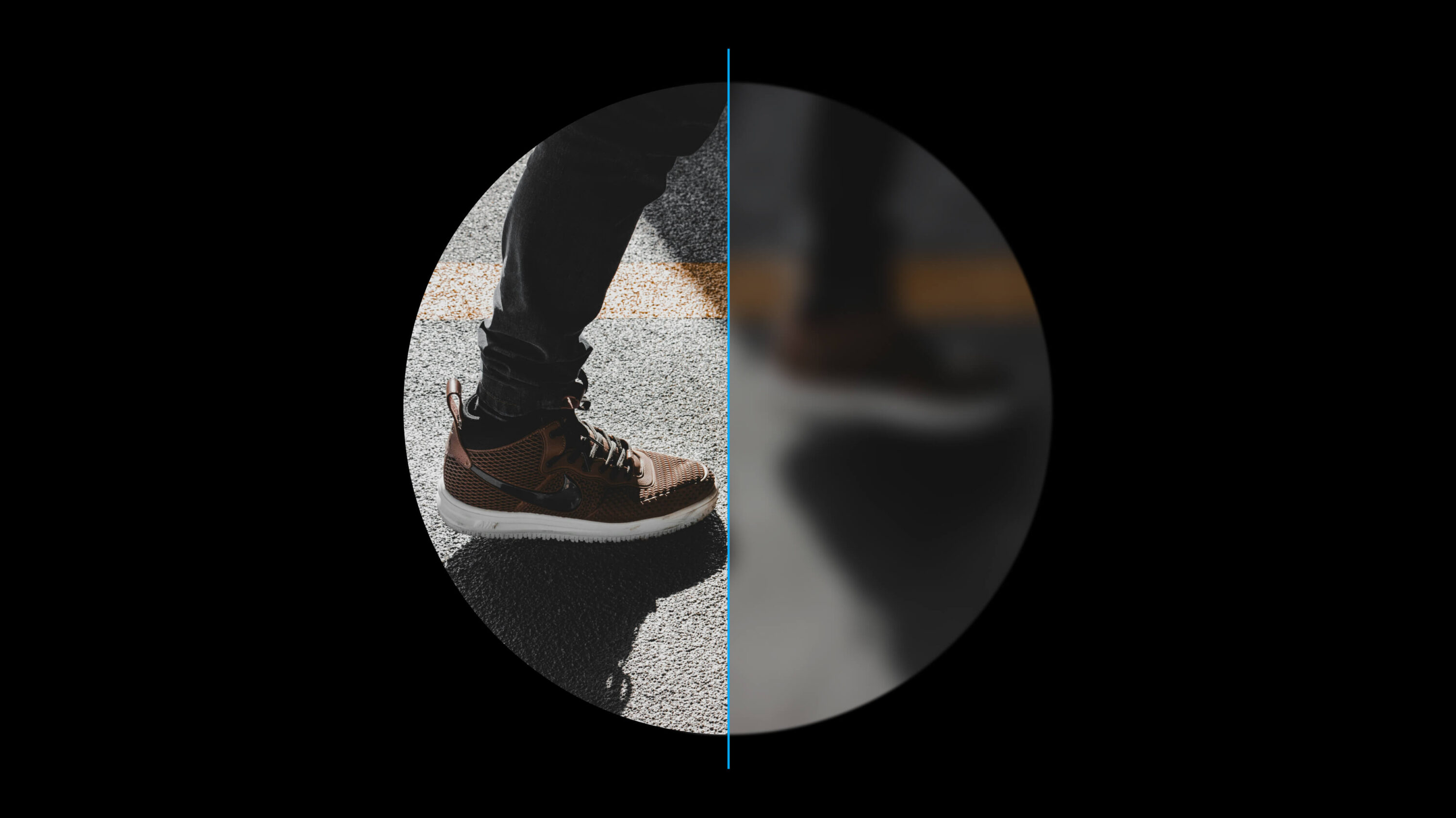
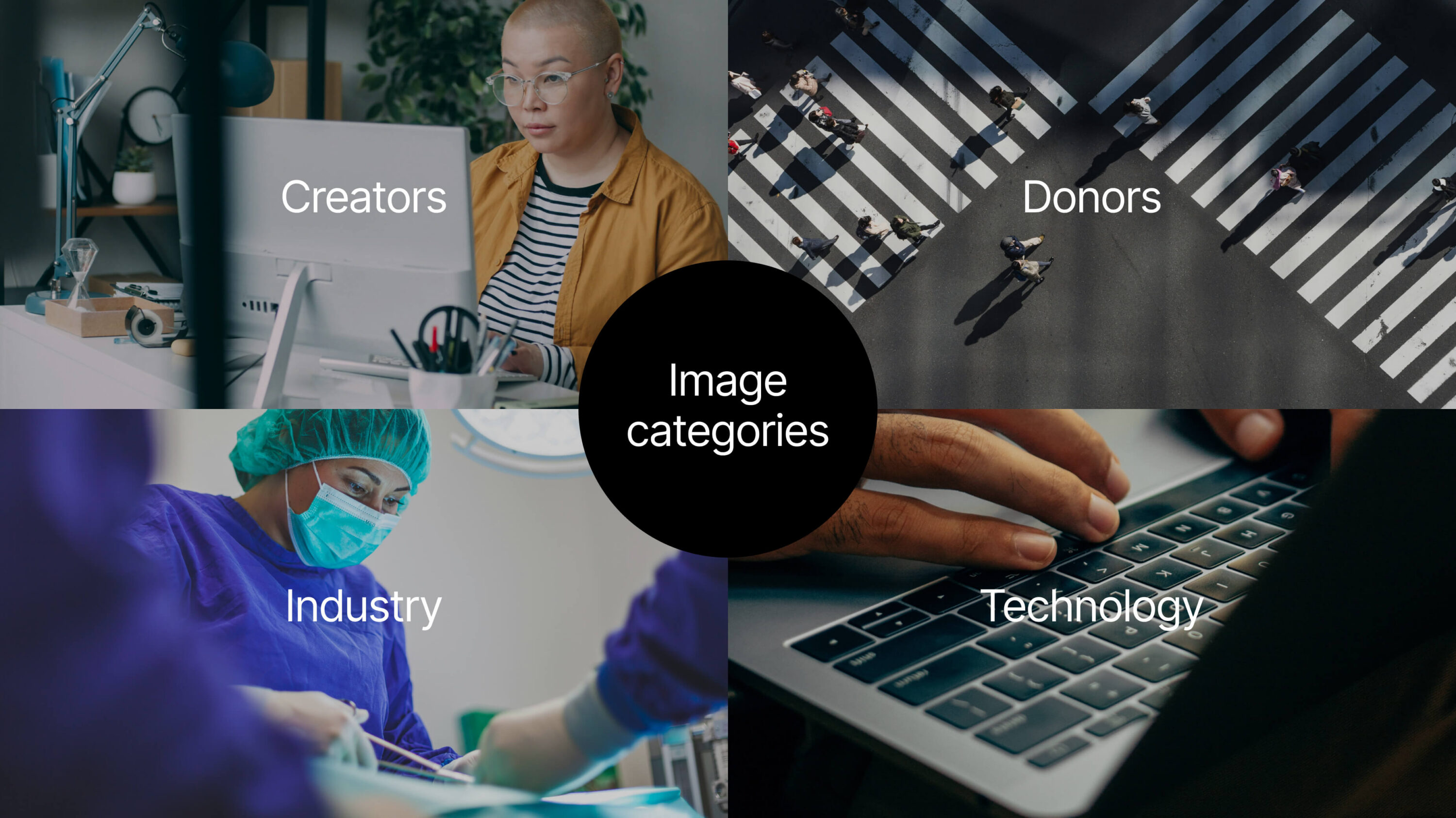
The visual “prediction” device extends flexibly across the new Squark AI website, content, events and sales collateral. This includes the cursor line, the use of circles calling back to the ellipsis, and a complementary icon style. Photography is used to hero the donor persona as well as subjects form the nonprofit sectors Squark AI serves. To these images we apply a treatment that combines sharp focus with blurriness, emphasising the fact that Squark’s machine learning models bring the most likely fundraising futures into view.
Our progressive new identity introduces a confident simplicity, shaping a brandthat feels both approachable and trusted – one that Squark AI can proudly share with the world.
Circles
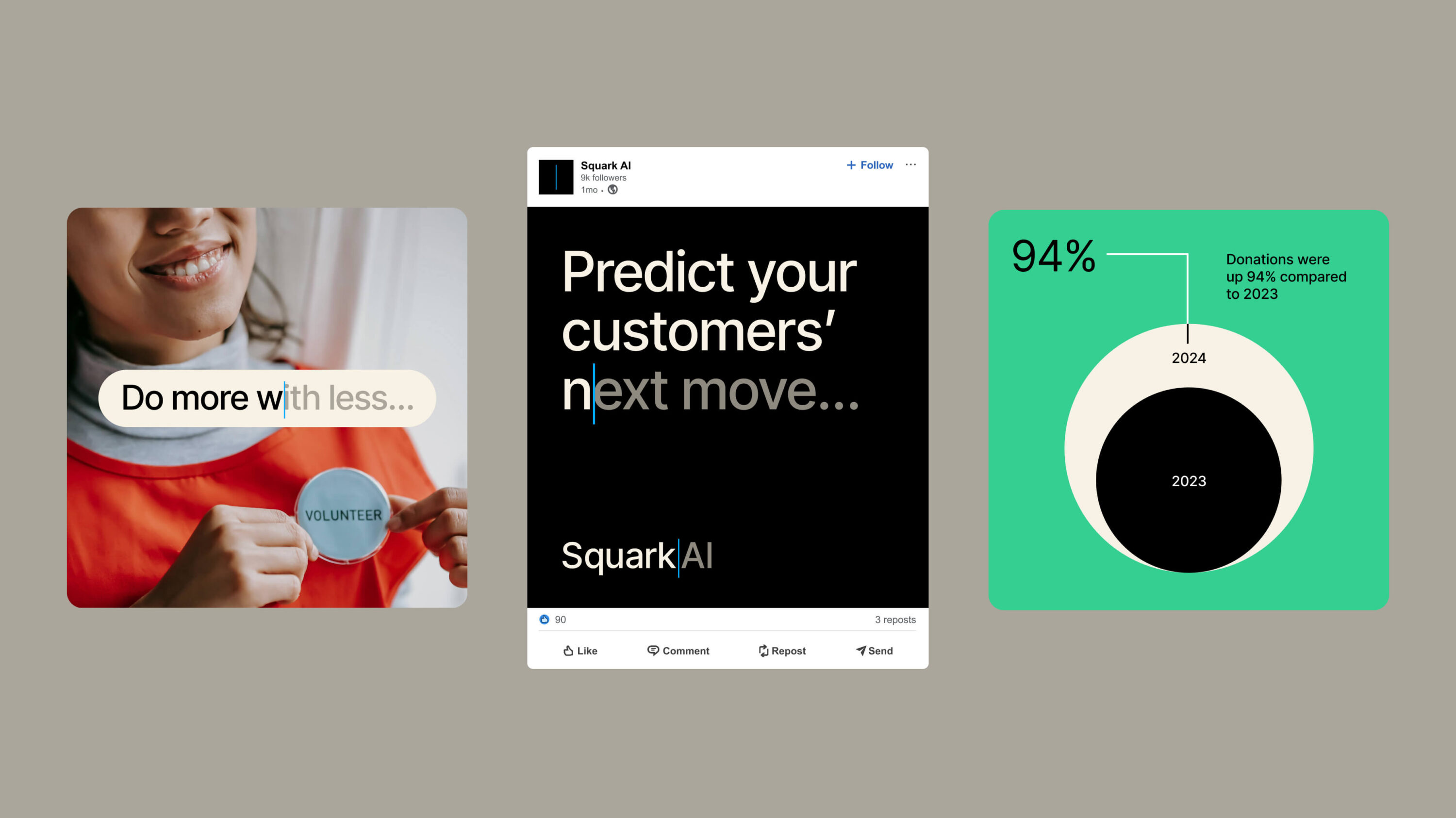
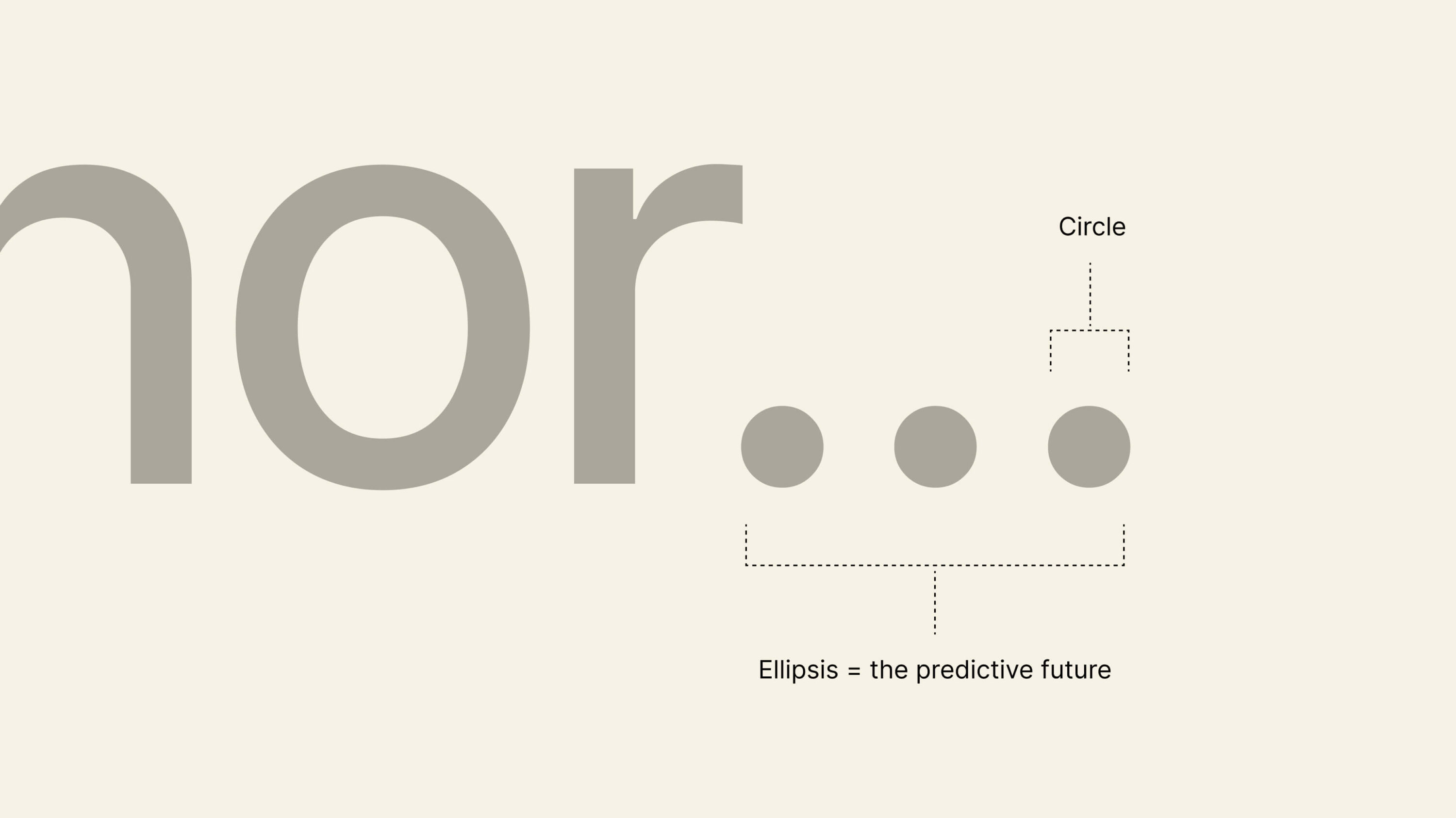
Circles are a defining element of the brand system, originating from the ellipsis used in headline statements. This motif carries through across all brand assets – appearing as full circular forms as well as softened, rounded corners. Circles are used to frame imagery, contain text and data, and subtly echo the aesthetic of digital UI input fields.
As a counterpoint to the sister linear cursor line device, the circle introduces balance – adding softness, approachability and warmth to the overall visual language.
Brand guidelines
We developed a comprehensive 100-page brand guidelines document to ensure clarity and consistency across every touchpoint. The guidelines articulate the brand’s core principles and provide practical direction for implementation, covering story and messaging, logo usage, colour palette, typography, photography, iconography, and data visualisation.
Designed as both a strategic foundation and a hands-on toolkit, the document empowers internal teams and partners to apply the brand with confidence and cohesion.

Promotional items
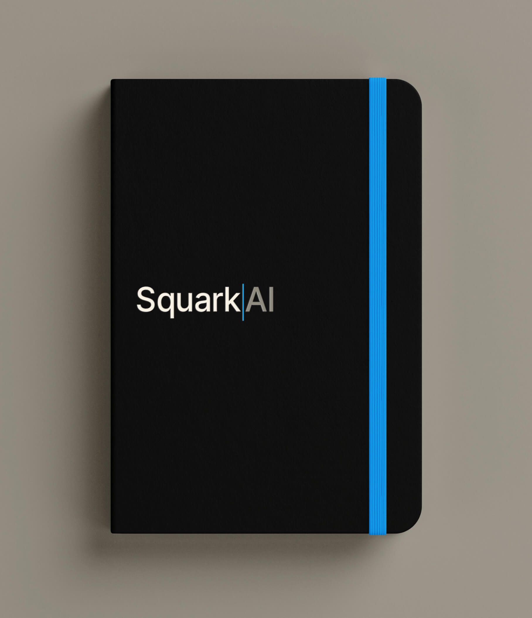
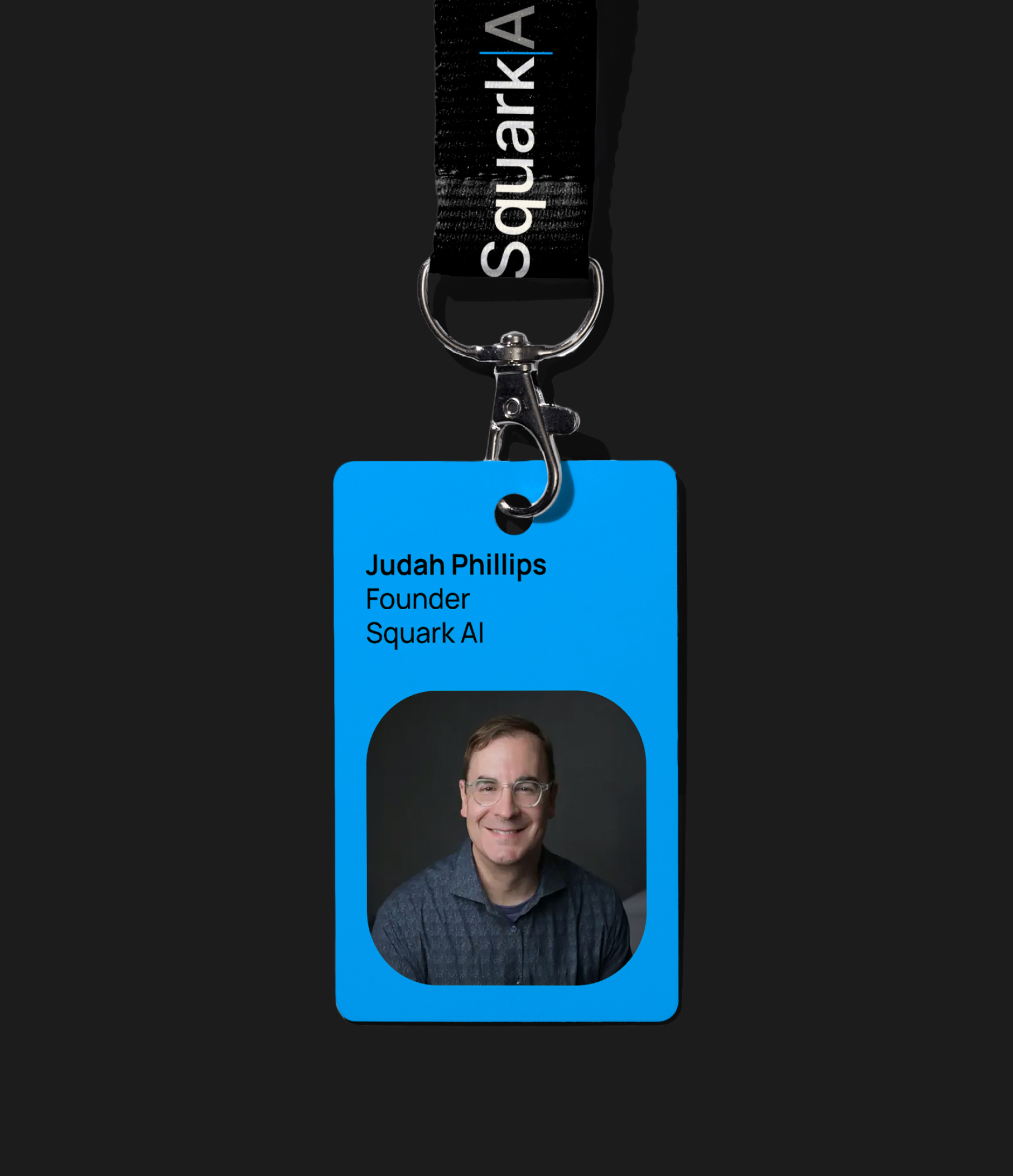
To demonstrate the brand in action, we applied the visual system across a range of promotional materials for trade events and industry activations. From stickers and notepads to tote bags and branded merchandise, each item was designed to reinforce recognition while maintaining the brand’s distinctive tone and personality.
These tangible applications helped extend the brand beyond digital and print communications, creating memorable, shareable touchpoints in physical spaces.




Testimonial