Placements.io: A rebrand and new website
Client
Placements.io
What we did
Brand positioning
Brand narrative
Messaging
Brand visual identity
New website
Placements.io – a Seattle-based adtech scale-up that helps businesses buy and sell digital advertising – was making waves. Under CEO and founder Ed Fu’s leadership, Placements had grown to 60-plus team members in six global offices. All without a marketing team in place.
Impressive stuff. Good product-market fit, excellent dev chops, and a highly capable sales team had brought significant success. But Ed knew Placements could grow bigger, faster, with an effective brand, the right story, and a solid marketing operation in place. So he brought in Andy Shirey to help.
Enter Beneath. We helped Andy, Ed and the Placements team tell a story about how they had built the world’s leading operating systems for both buyers and sellers of digital advertising – making the industry more efficient, transparent, and profitable for publishers and advertisers.
Here’s how we did it
Positioning Placements.
We dug into our research and worked closely with the Placements team to figure out how their two primary products provided the best solutions for the problems faced by their target audiences. It was a joy to work with an expert product marketer like Andy on this.
Developing a brand narrative.
The positioning gave us the framing and elements for a brand narrative as well as messaging frameworks for multiple personas and industries.
Creating a new brand.
With the positioning and narrative in place, and a branding workshop complete, our design team developed a visual identity in close partnership with Ed, Andy and the team.
Building a new website.
The positioning, narrative, messaging, and visual identity were essential pieces of the website puzzle. With these in place, the web build ran like clockwork.


Telling the right story
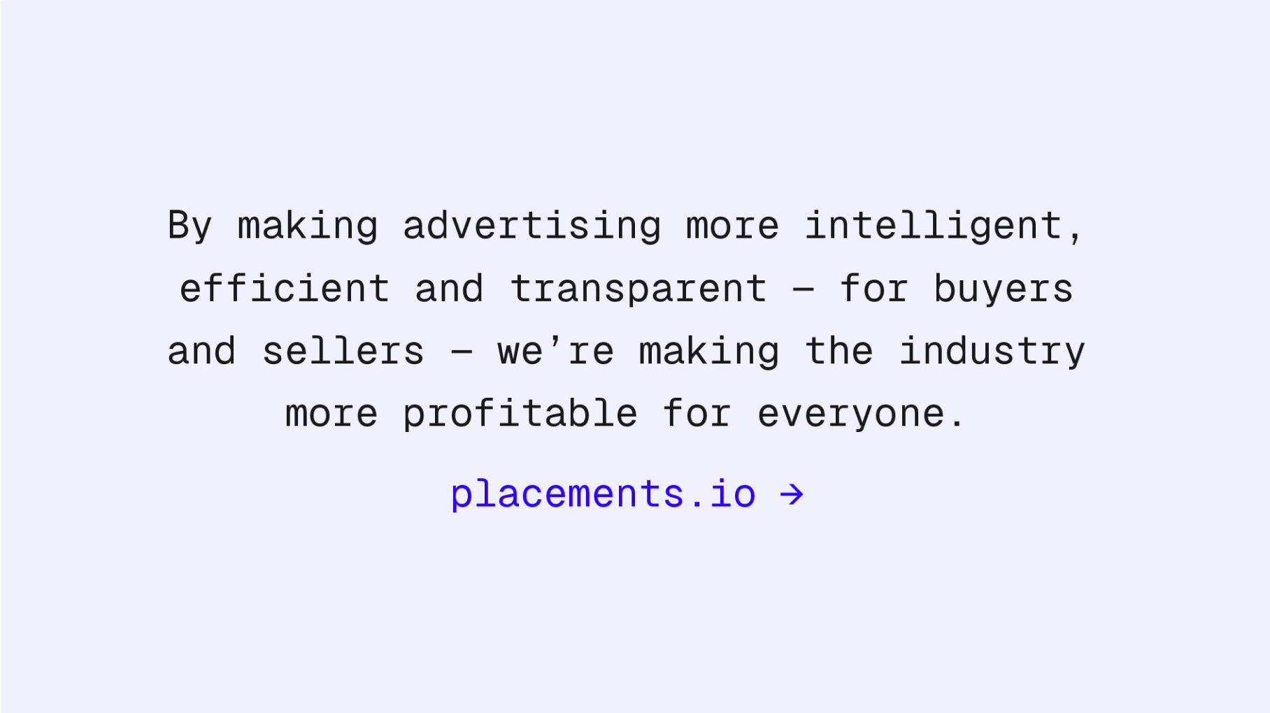
With the help of the Placements team, we developed an emotive story about how digital advertising was broken. How it had become a fragmented space in which complexity and commoditization meant publishers didn’t get the revenue they deserve, and brands and agencies struggled to achieve sufficient return on their investment.
Placements was the hero in this story. Its operating systems were making digital advertising more intelligent, efficient, transparent, and profitable – for buyers and sellers. Placements was making the industry better for everyone. The story could then be flexed for audiences including prospects, customers, team members and the investment community during active fundraising.

The visual identity
Modular design system
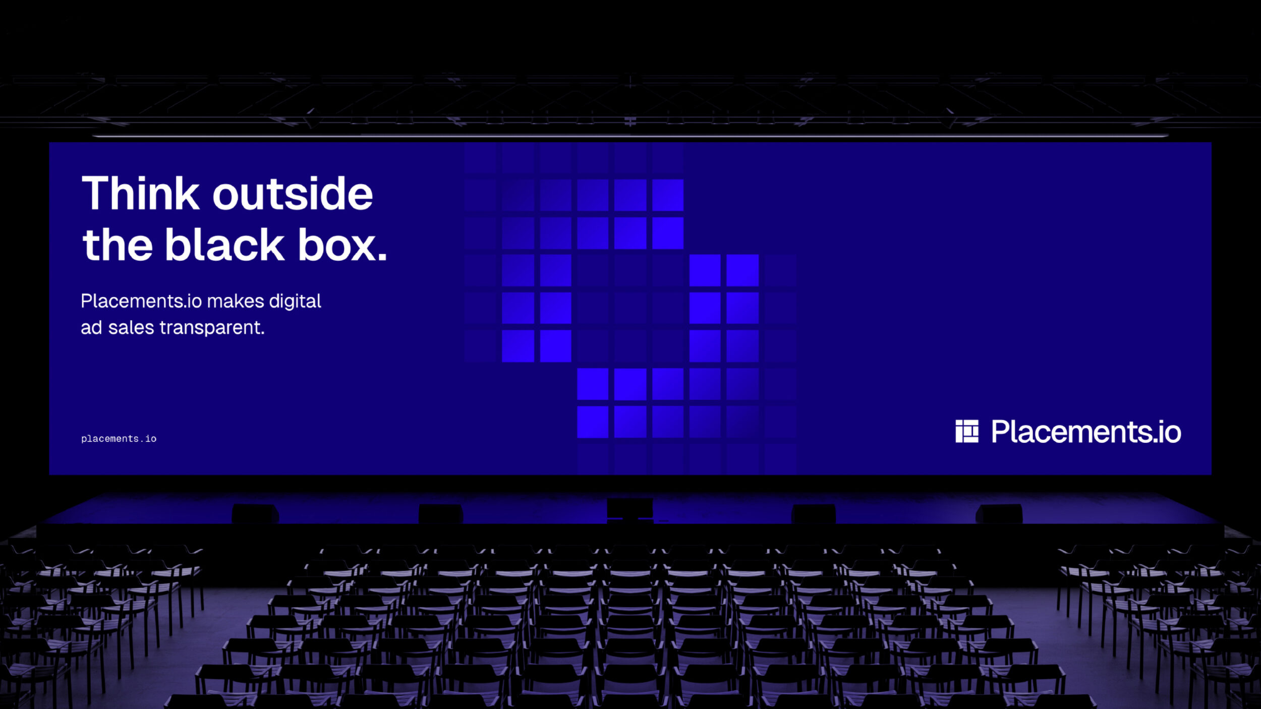
The shapes featured in the previous Placements logo informed a new modular design language.
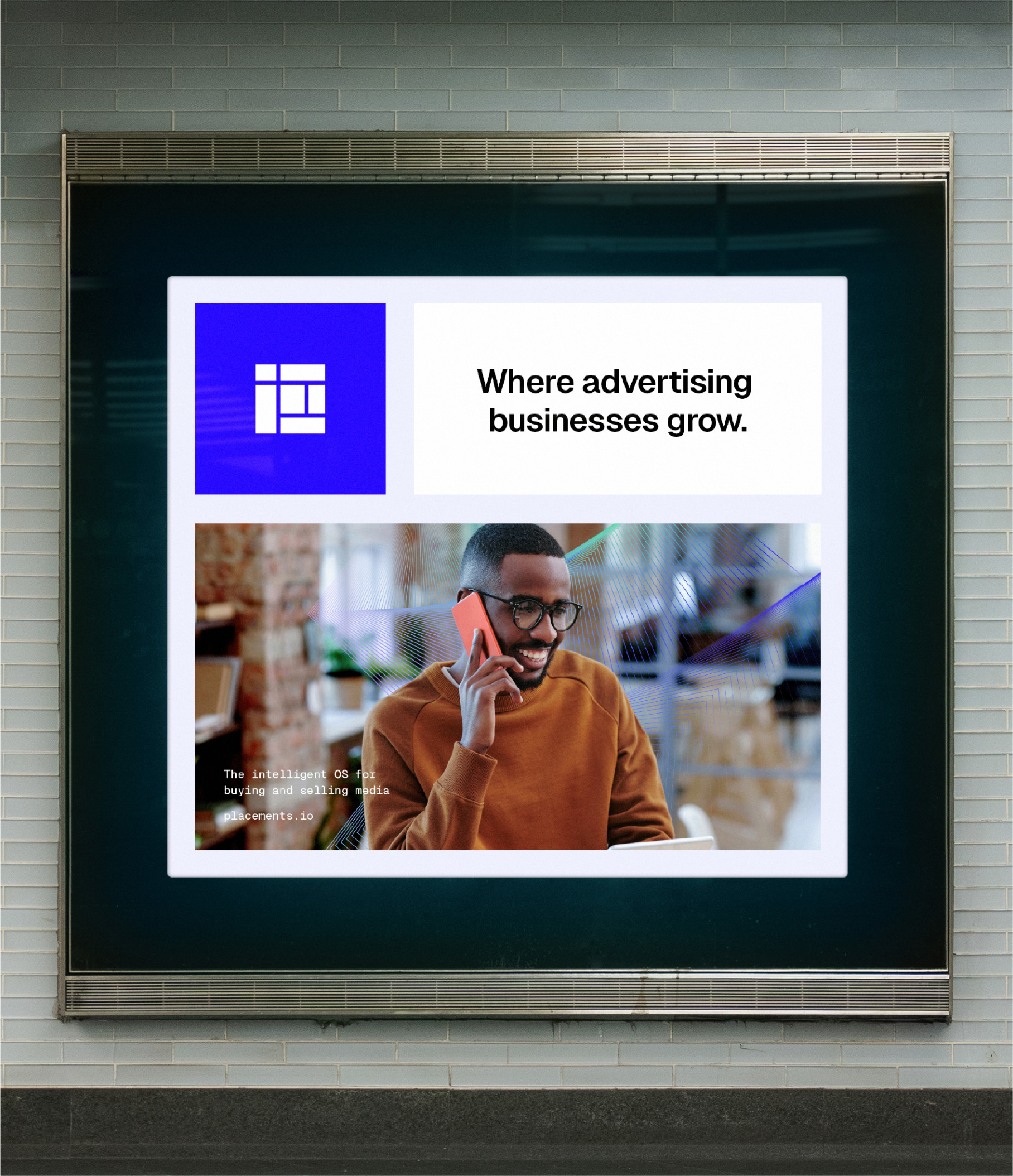
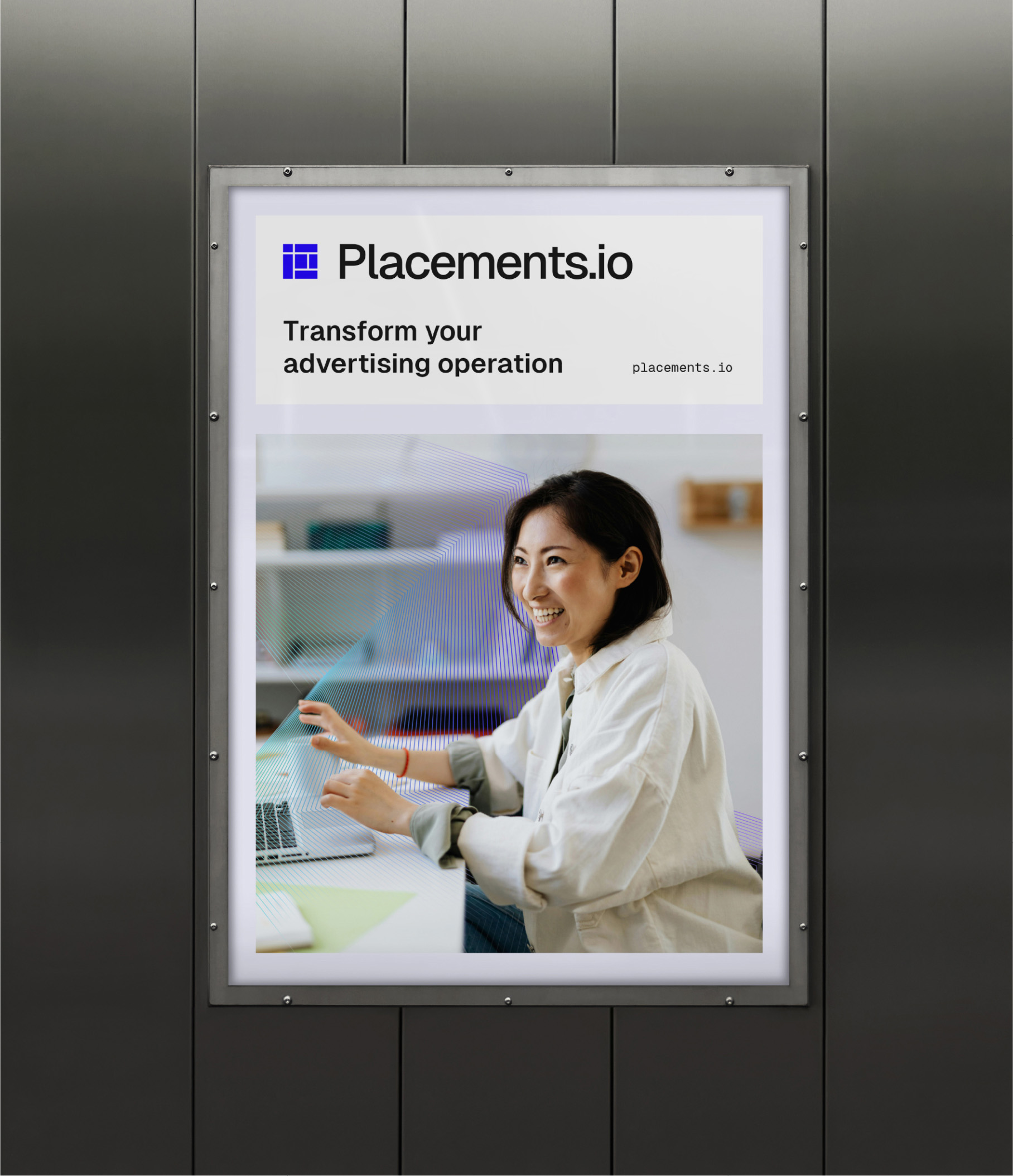
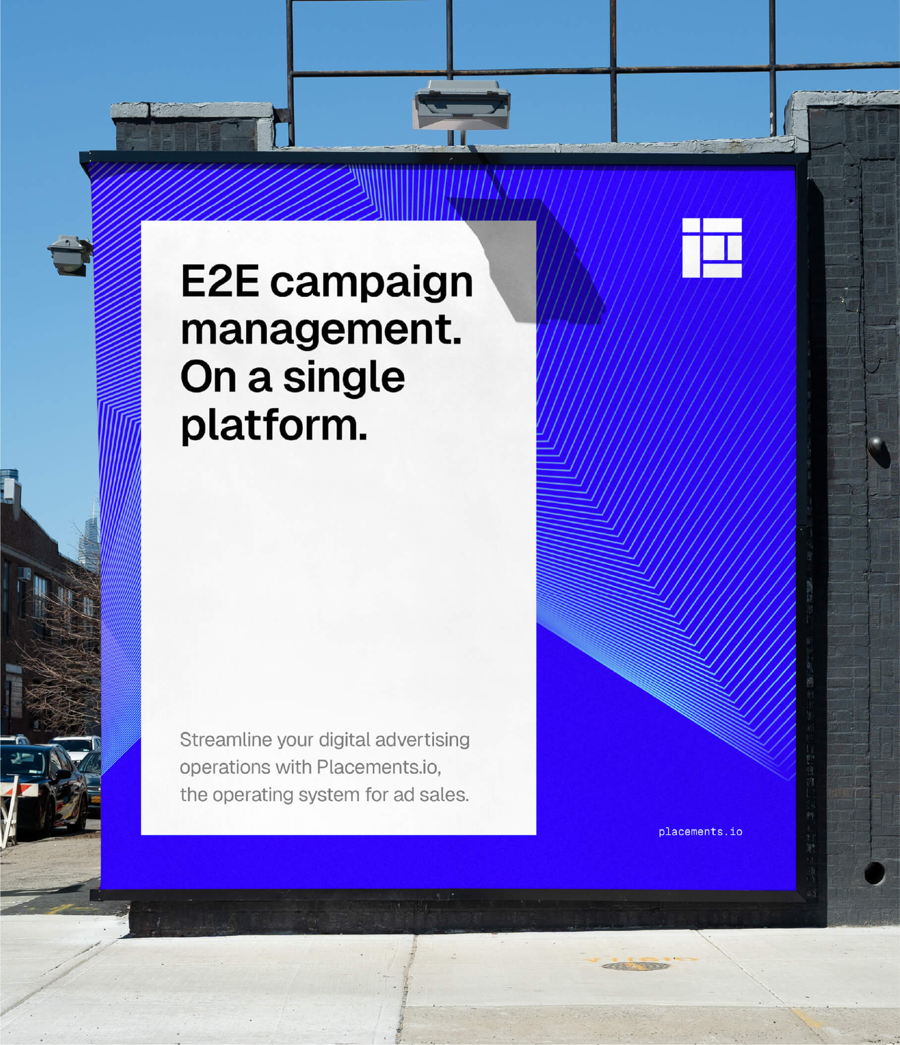
We retained the block structures from the primary logo and transposed these forms into a flexible modular grid system, that can be applied to almost any brand touchpoint. Imagery and text is now displayed in squared off shapes with adjoining gutters, mirroring the brand symbol itself. This helps to section content and simplify messaging.



Colour
From the original concepting phase, electric blue emerged as the winning colour. It wasn’t used much among Placements.io’s competitors. And it had the advantage of conveying the sense of trust the Placements team felt was important. It was available and effective.
We used the same logo grid system to develop individual symbols for each of Placements’ products. The colours were chosen to differentiate each of the products while also working harmoniously with the primary Placements blue.


Graphic devices
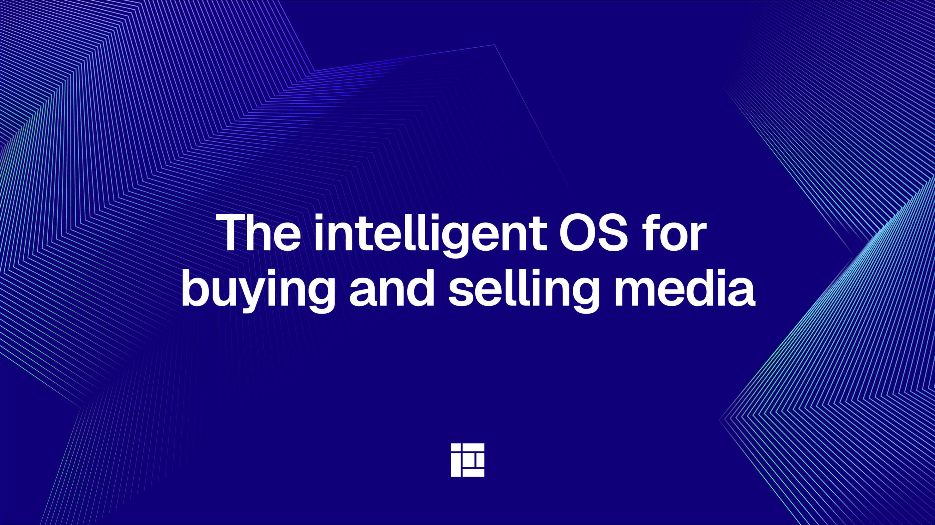
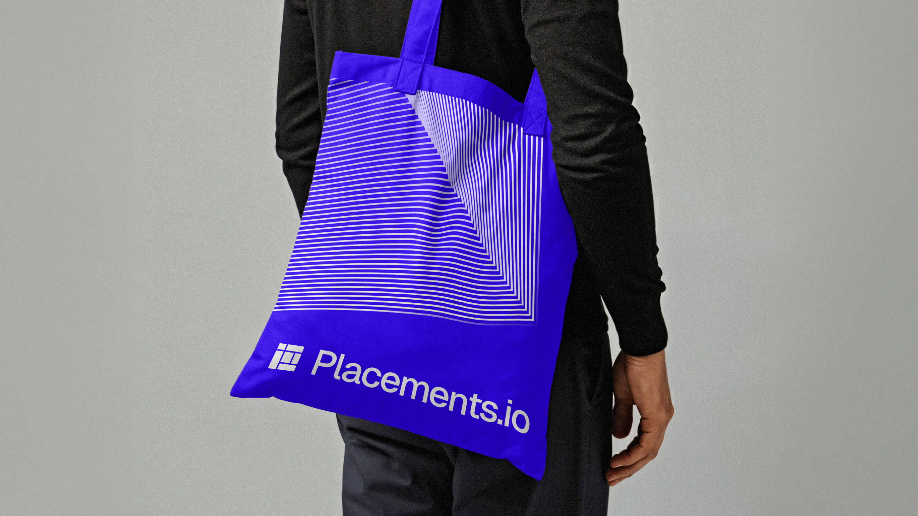
To bolster the Placements toolkit, we developed a series of supporting graphics featuring linear lines. This graphic device is integrated into photography and utilised as background treatments across brand comms. Linear lines were chosen to represent layers of information, interconnecting systems and data flow.




Creating the Placements.io website
Our process
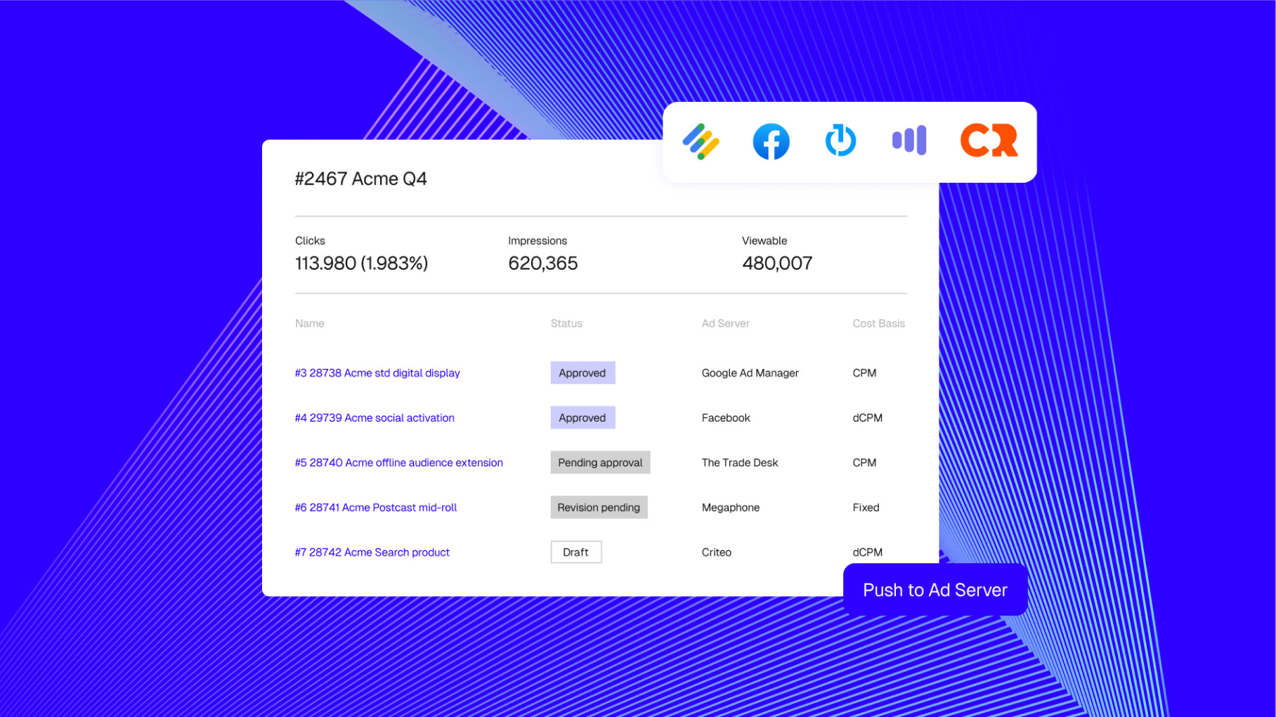
- Our design team flowed through all the visual executions from the identity into the site design, developing product illustrations, from conceptual to more accurate representations.
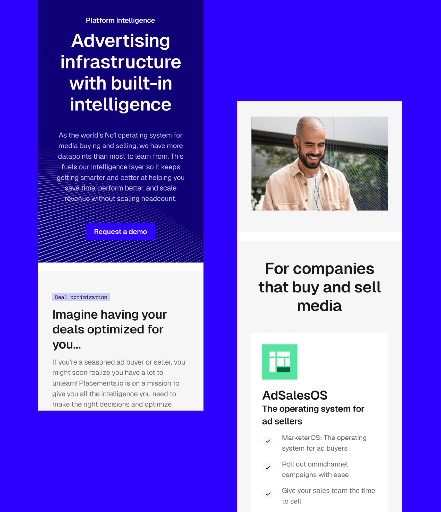
- A clear distinction was created between product pages using individual colour systems defined in the visual identity work.
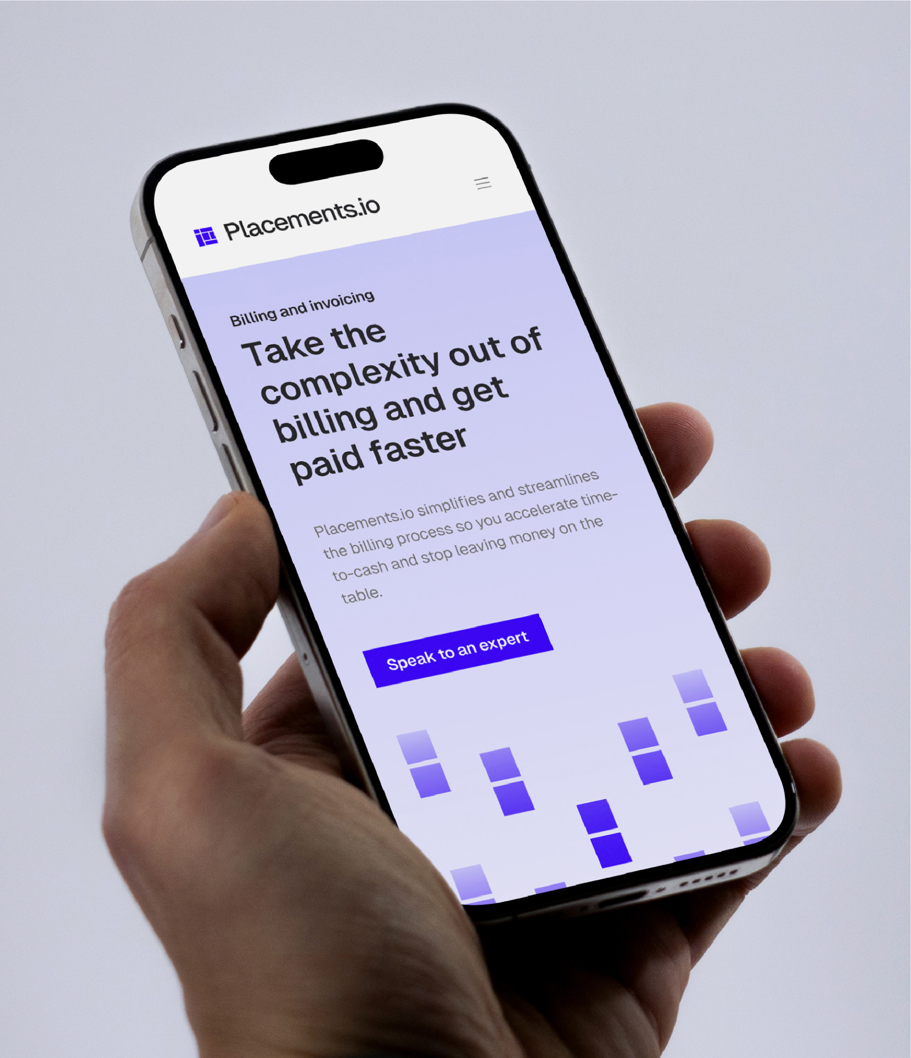
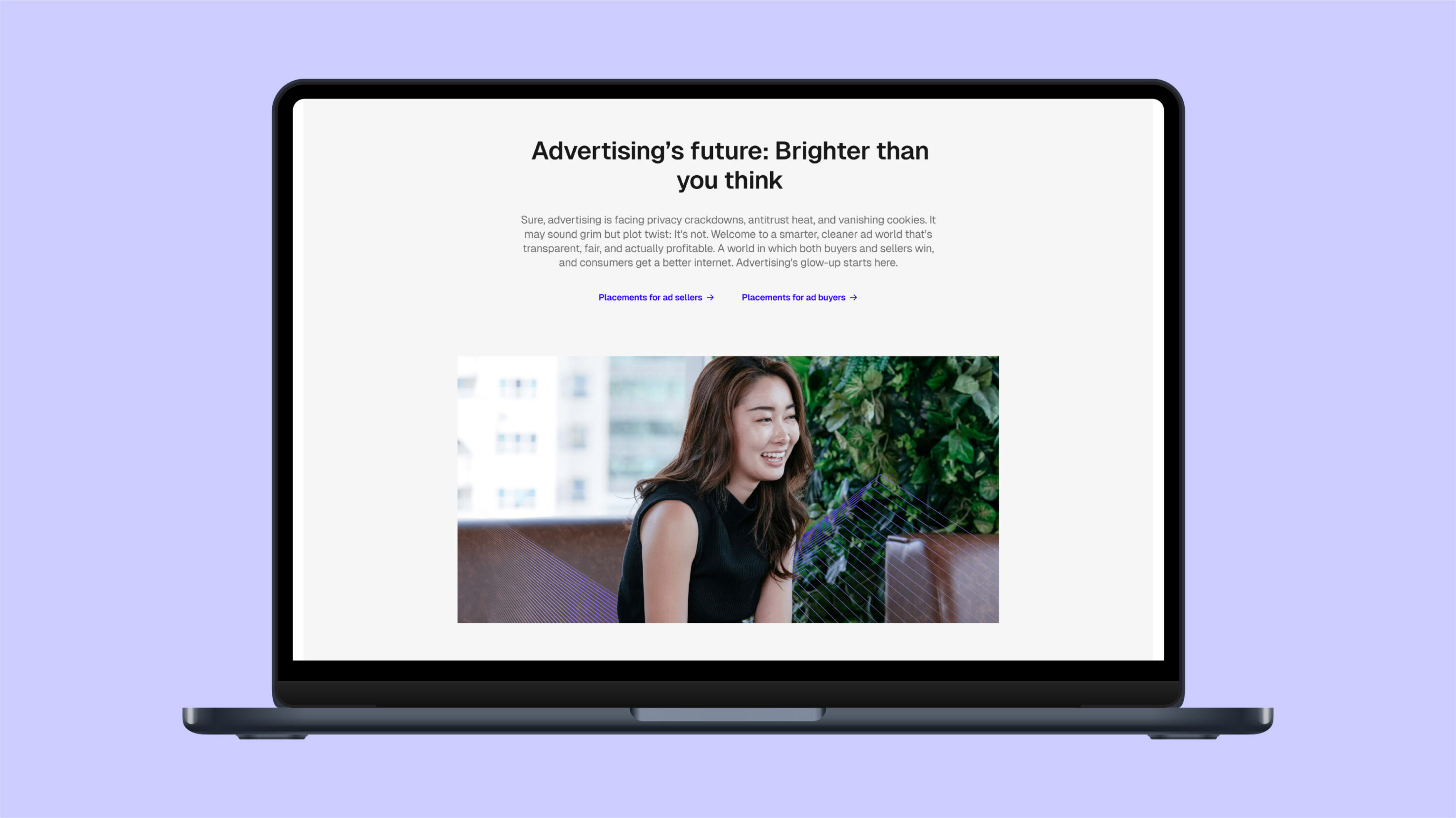
- A fully responsive theme in Webflow was built.
- Brand visuals and illustrations were brought to life with animations triggered by user scrolls.



Brand rollout
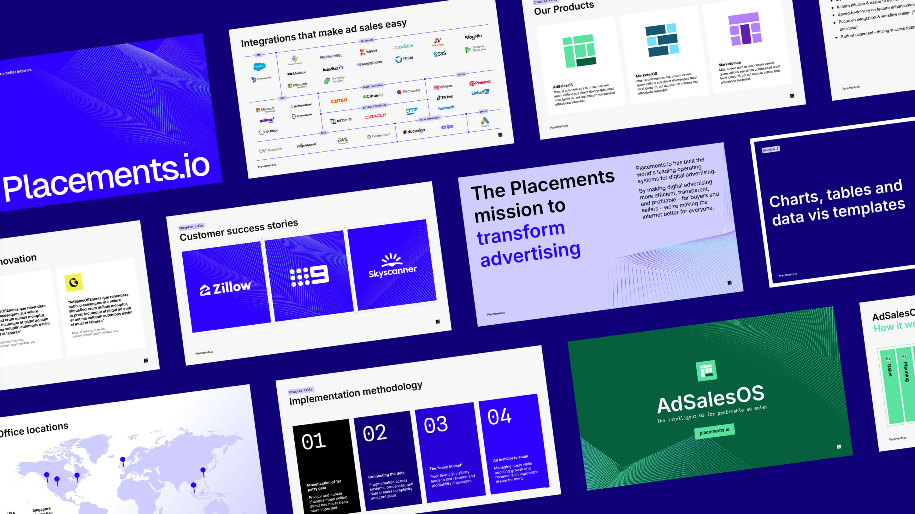
Once the new brand was finalised, we successfully rolled out the Placements identity across all key brand touch points – including marketing templates, signage and merch.
Placements.io attributed six figures of revenue to the brand narrative, rebrand and website after three months alone.
We’re proud to still be working with Placements.io on various content projects. Expect big things from this business. Thanks Andy, Ed and the team. This was a fun one.


Testimonial